Bento Box Grid
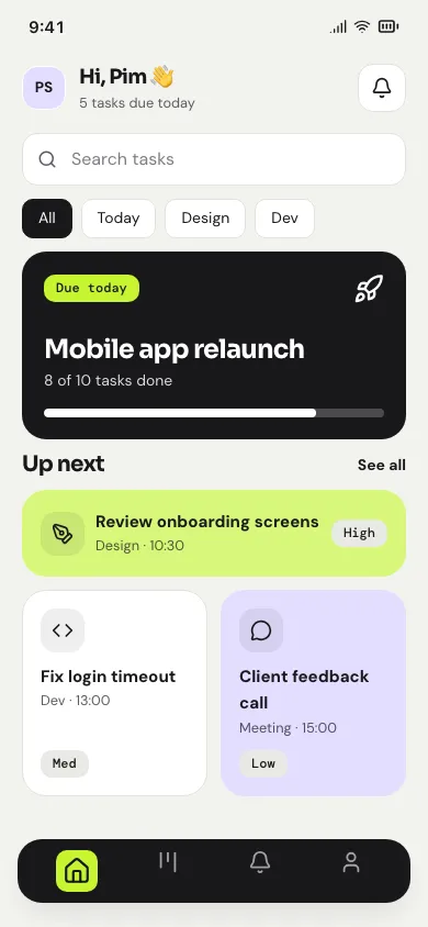
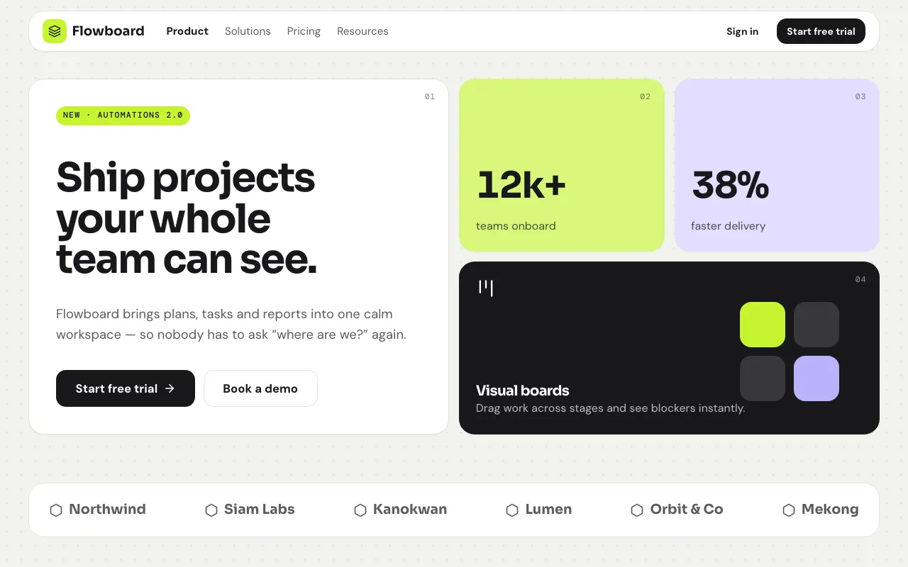
“Bento tiles” · Sora + K2D
Everything is a tile: a modular, asymmetric grid of rounded boxes in mixed sizes and a few flat tints, held together by one tight, even gutter.
modular tilesmixed tile sizesasymmetric grid
UI Lingo
ชี้สไตล์ที่ชอบ คุยกันจบในคำเดียว
Browse 97 interactive UI styles with web and mobile demos in Thai and English. Shortlist favourites with your project owner, then hand developers an audited prompt.
Open styles side by side across landing, dashboard, form, article and mobile screens.
Heart the ones the owner likes and share one link to compare.
Agree on the style name and its keywords — the team vocabulary.
Copy the audited prompt into any coding agent, for web or mobile.
Whitespace, restraint, clarity first.
Everything is a tile: a modular, asymmetric grid of rounded boxes in mixed sizes and a few flat tints, held together by one tight, even gutter.
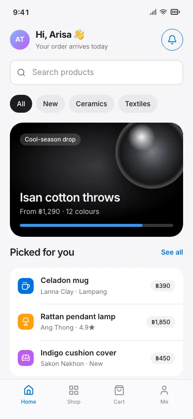
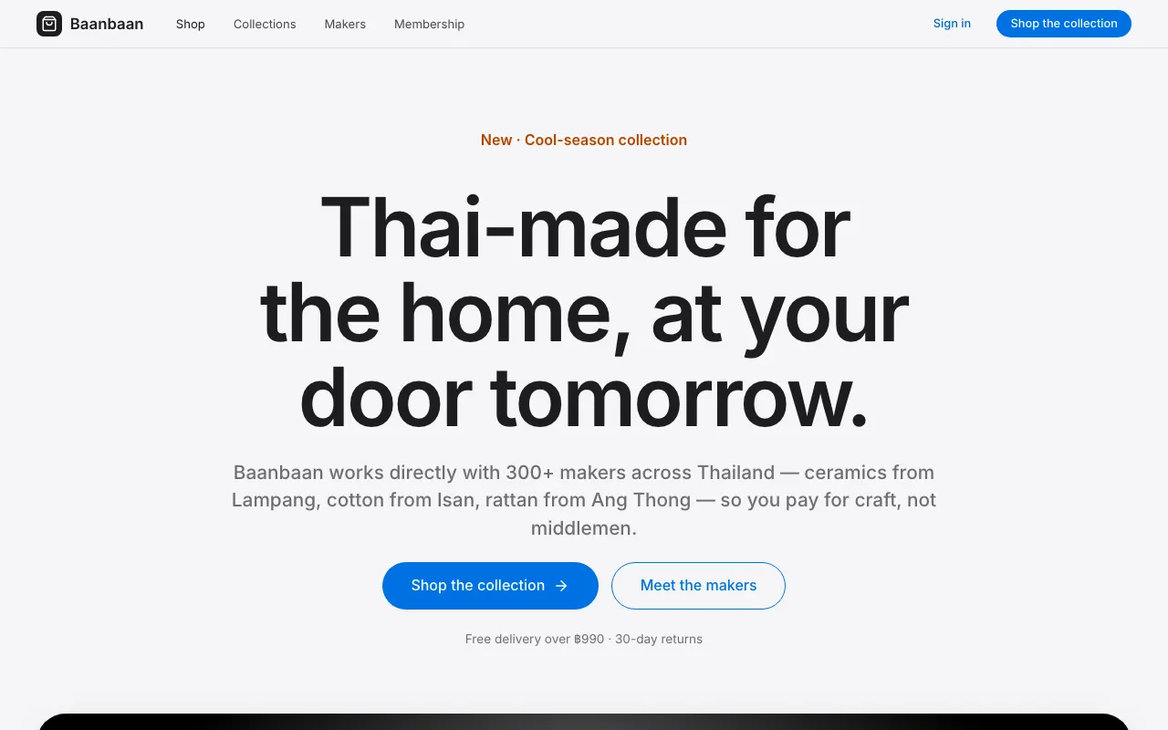
The Apple keynote slide as a web page: big 28–32px rounded white tiles on a #F5F5F7 grey canvas, huge tight headlines and studio-lit product renders.
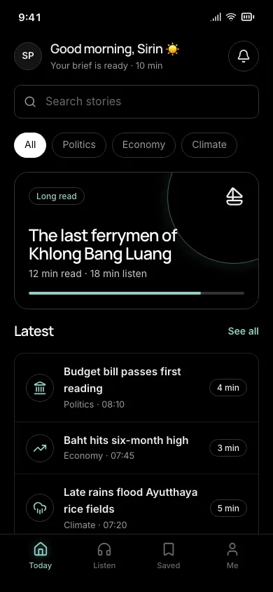
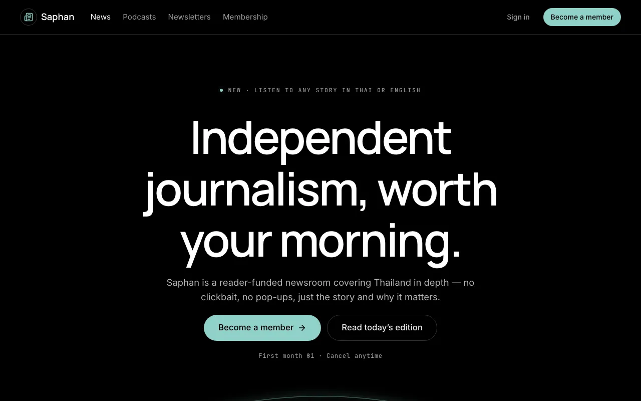
True #000 black canvas, hairline-defined surfaces, crisp off-white text and one desaturated accent — pixels off, content on.
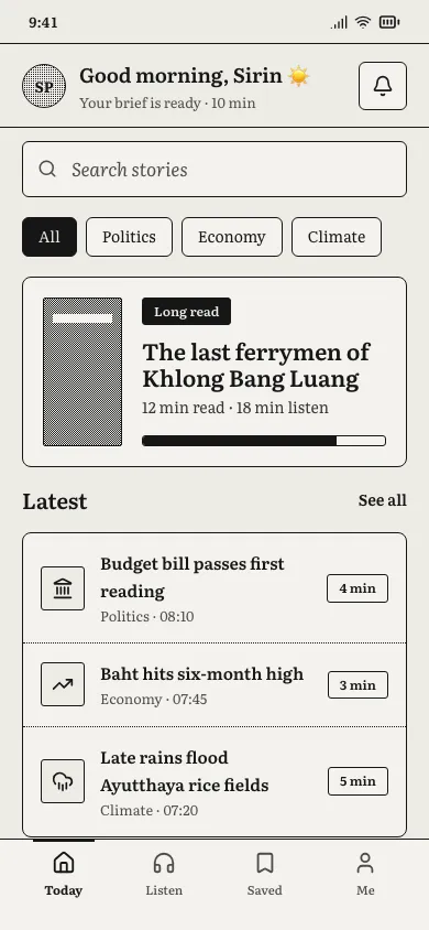
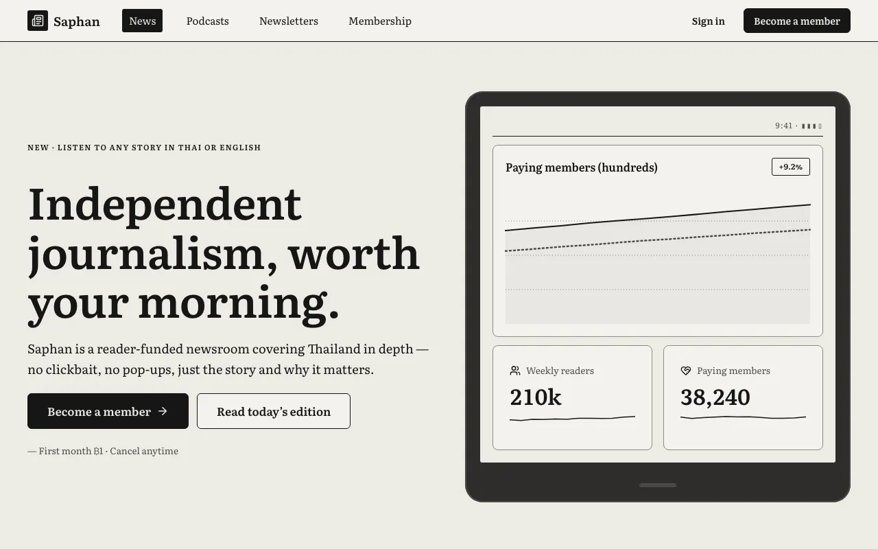
Matte grey-white paper, ink-black book serif, pixel-dithered greys and zero animation — an interface that reads like an e-reader page.
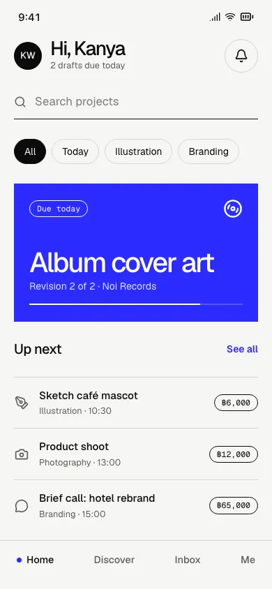
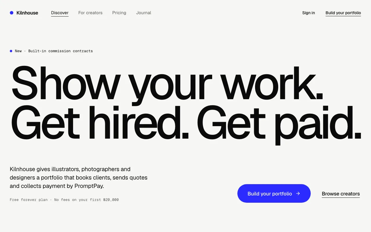
Headlines blown up to poster size on an almost empty page — no boxes, no icons, one electric-blue accent.
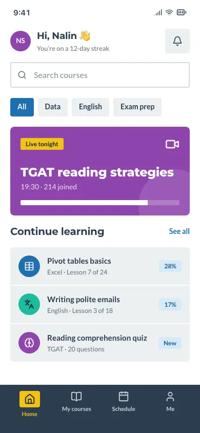
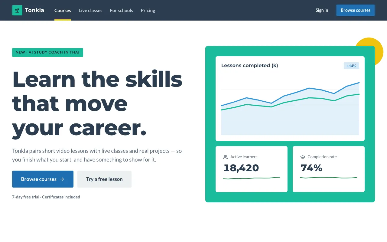
Pure 2D: solid colour blocks, no shadows, no gradients, no borders on cards — just bright flat fills, simple icons and clean type.
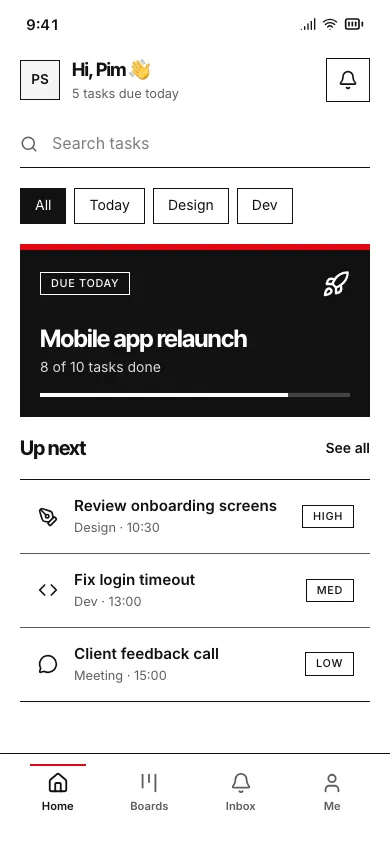
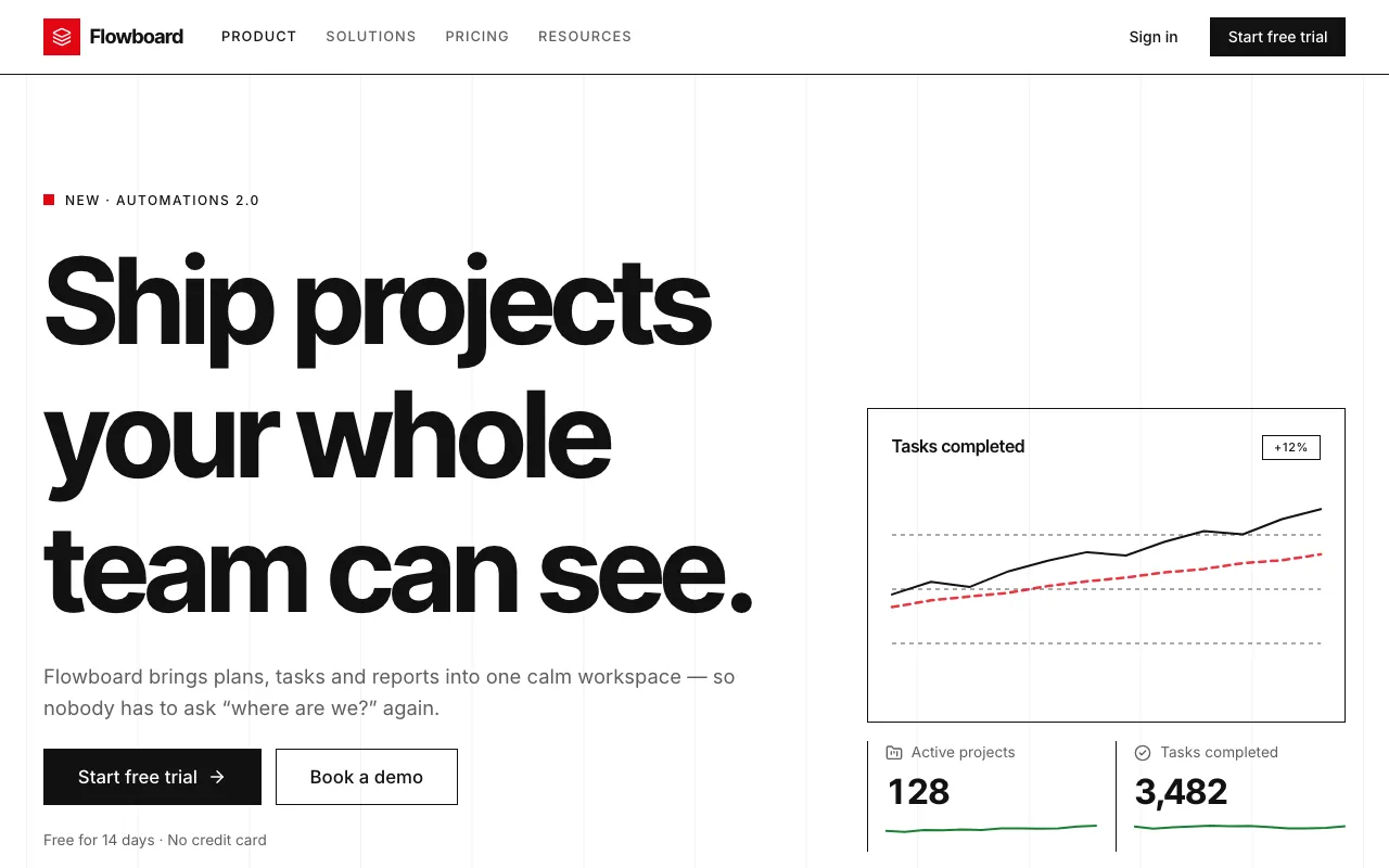
A strict grid, a neutral grotesque, black on white and one signal red — clarity as the aesthetic.
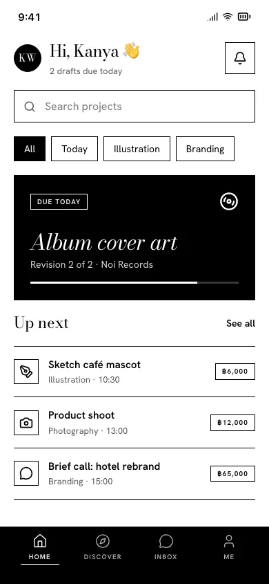
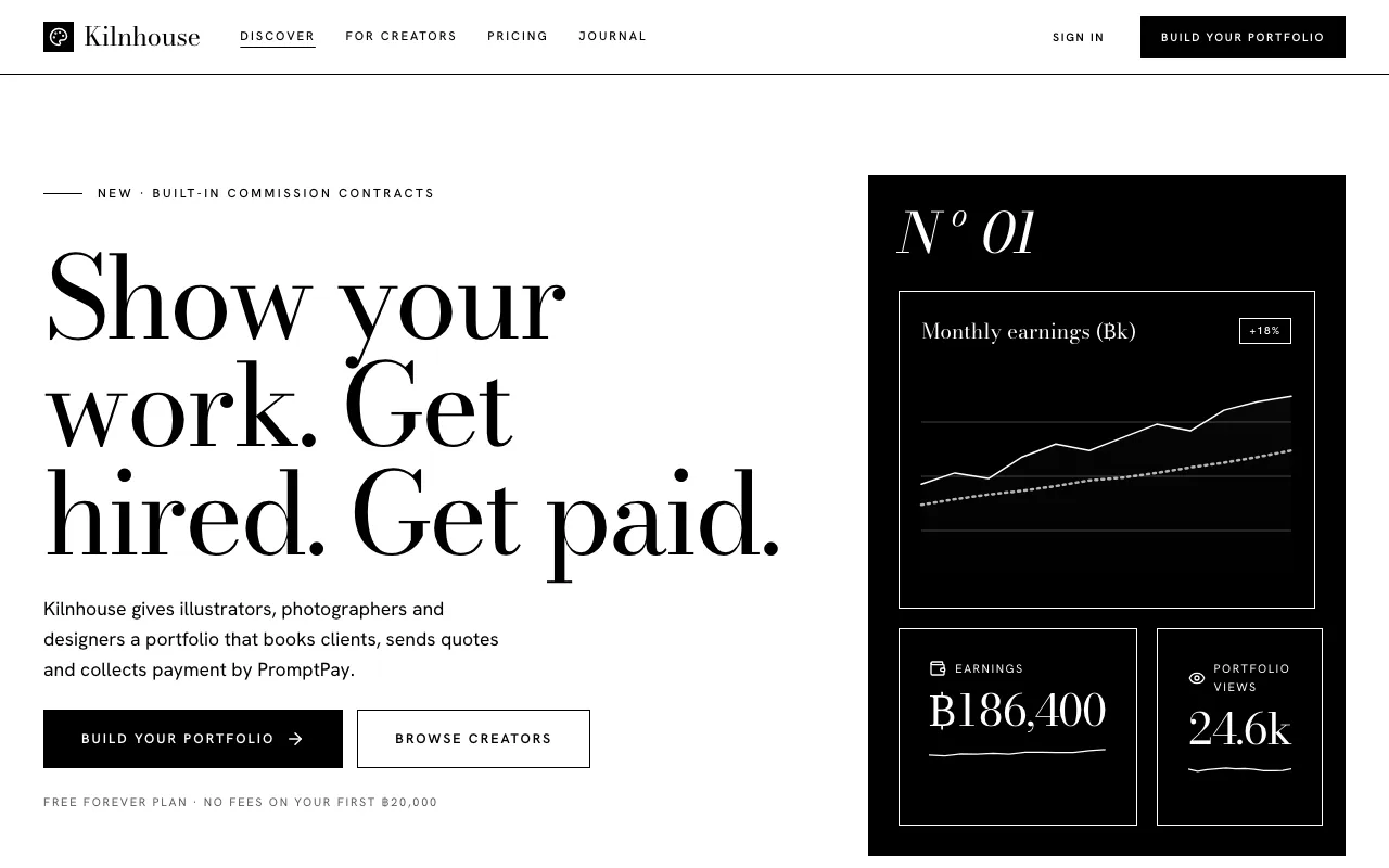
Pure #000 on #FFF, a high-contrast didone display, hairline rules and whole sections flipped to black — fashion-editorial austerity with zero colour.
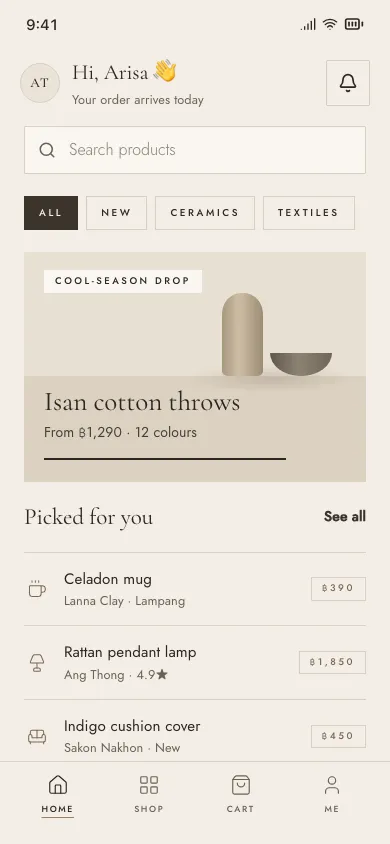
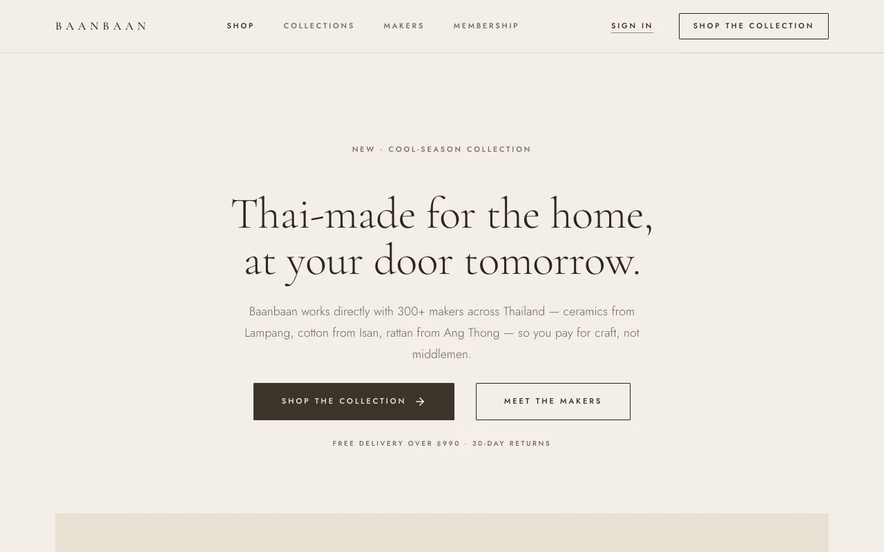
Warm stone and cream, a light Garamond, tiny tracked capitals and wide margins — luxury that whispers, with no logos or loud colour.
Depth, material and tactile surfaces.
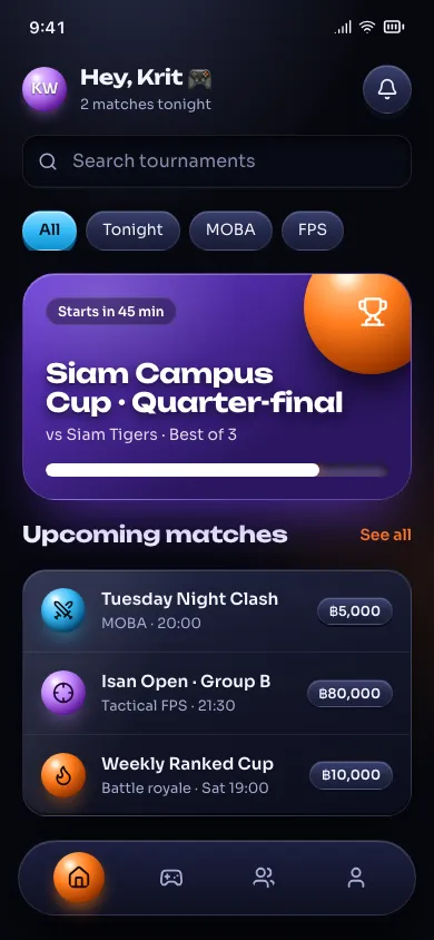
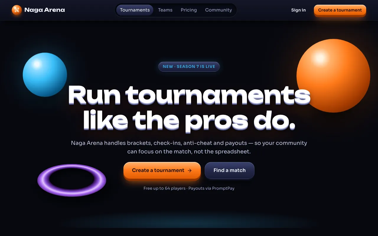
UI that looks rendered in a 3D studio: glossy spheres and slabs, thick bevelled buttons, deep perspective and dramatic spotlight on a dark stage.
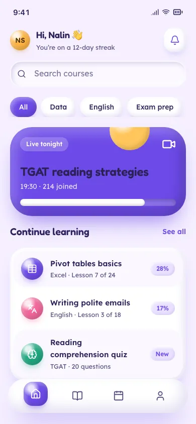
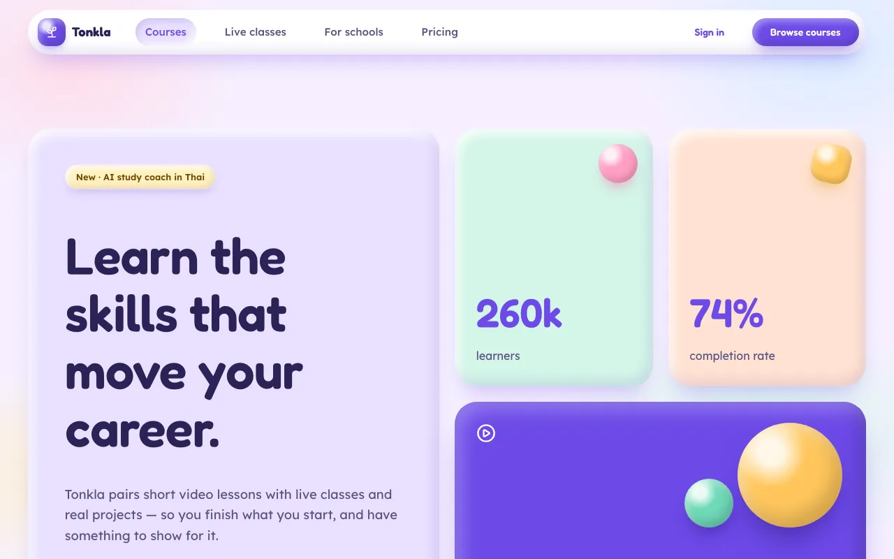
Chunky pastel shapes that look squeezed from modelling clay: huge radii, a bright inner highlight and a soft coloured shadow underneath.
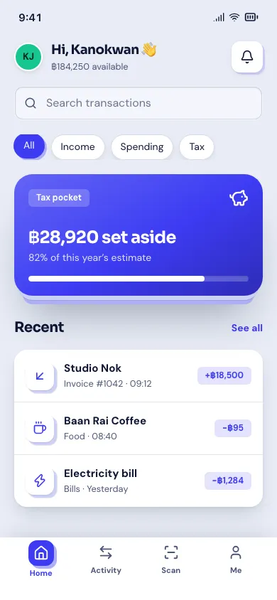
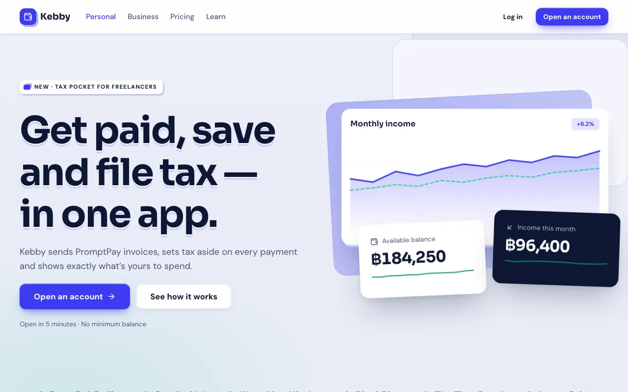
Crisp cards stacked at clear elevations, with offset sheets peeking out underneath and a gentle 3D tilt on hover.
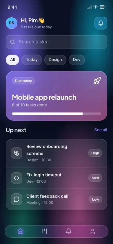
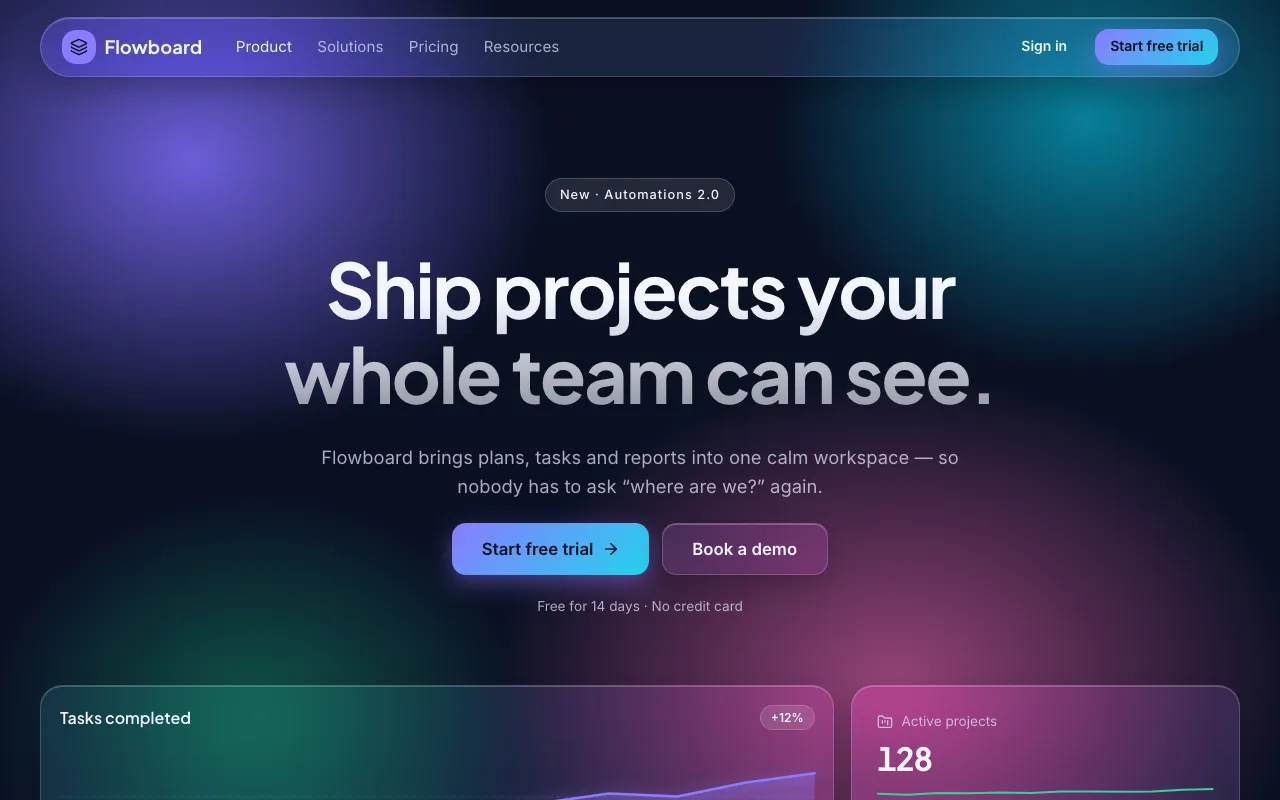
Translucent frosted panels floating over vivid colour blobs — depth through blur, not shadow.
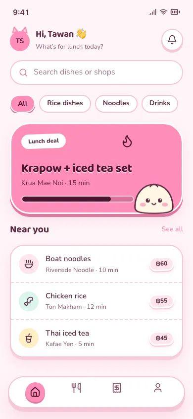
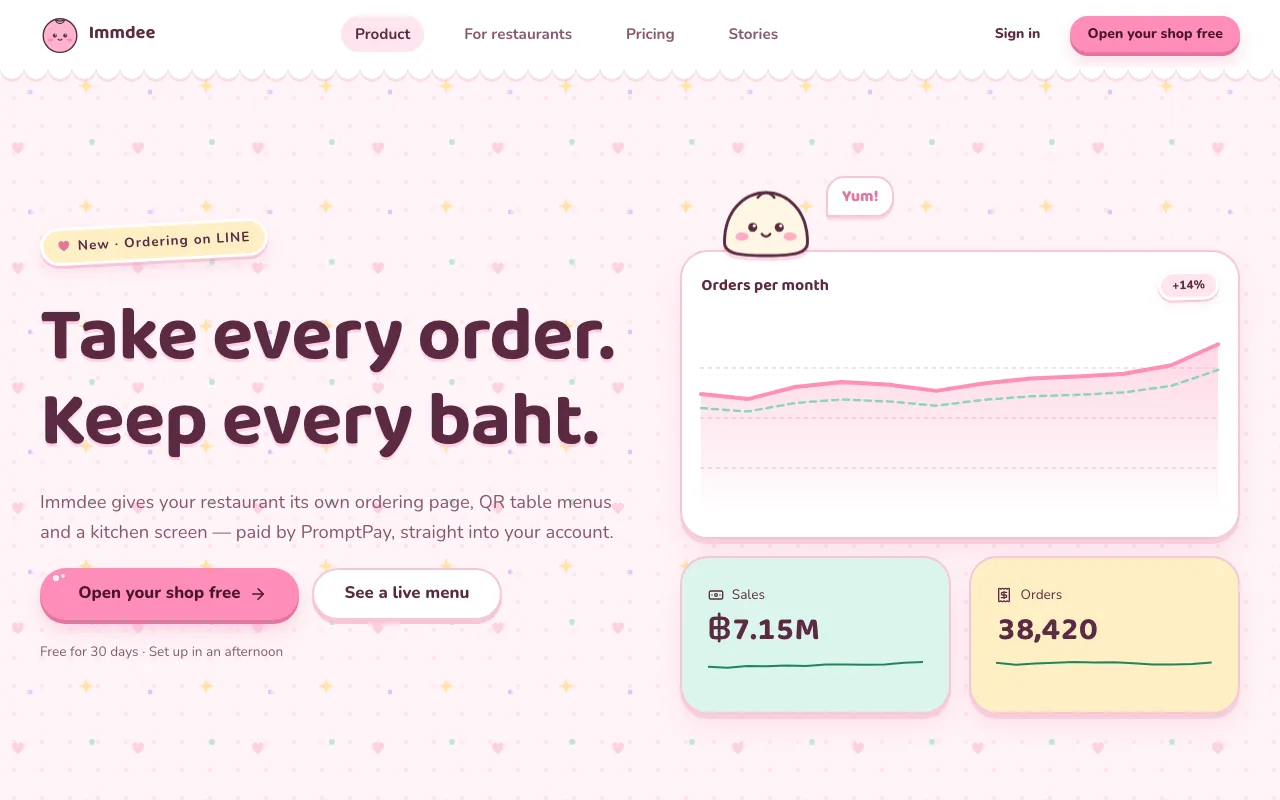
Pastel candy colours, everything round, little mascot faces and die-cut stickers — UI that smiles back.
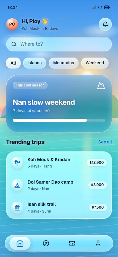
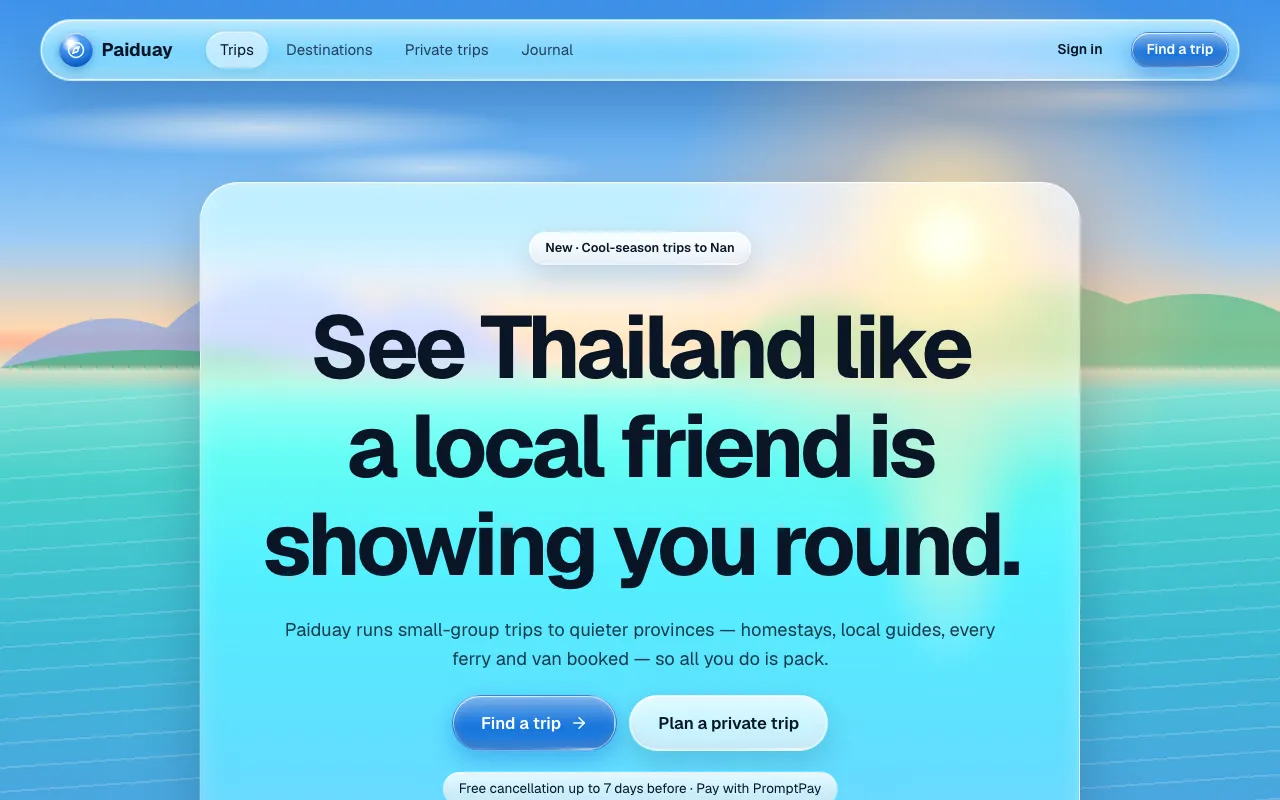
Thick, clear glass capsules with bright specular rims that float over vivid photography and bend the light behind them.
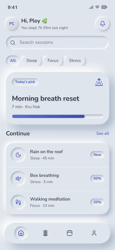
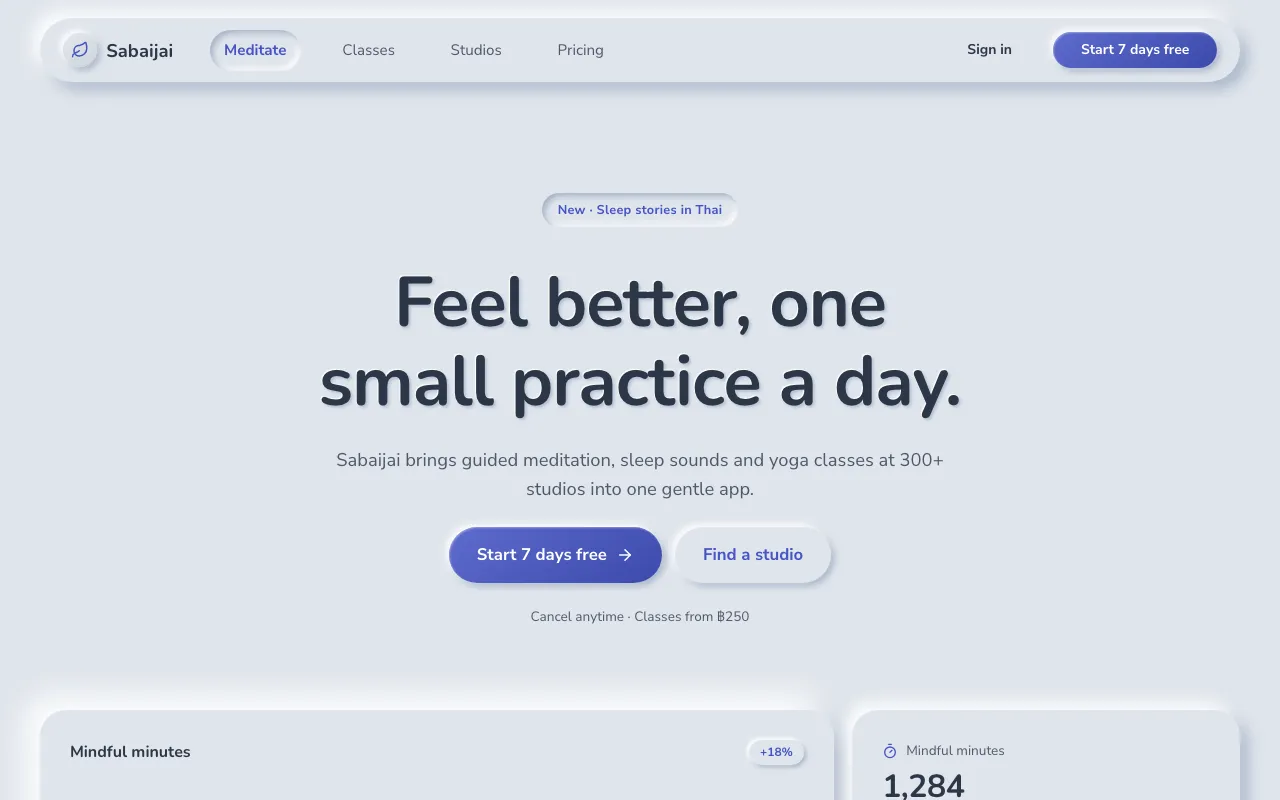
Everything is moulded from one soft grey-blue sheet: raised with a light and a dark shadow, pressed in with inset shadows.
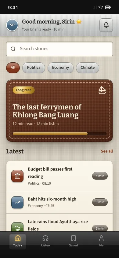
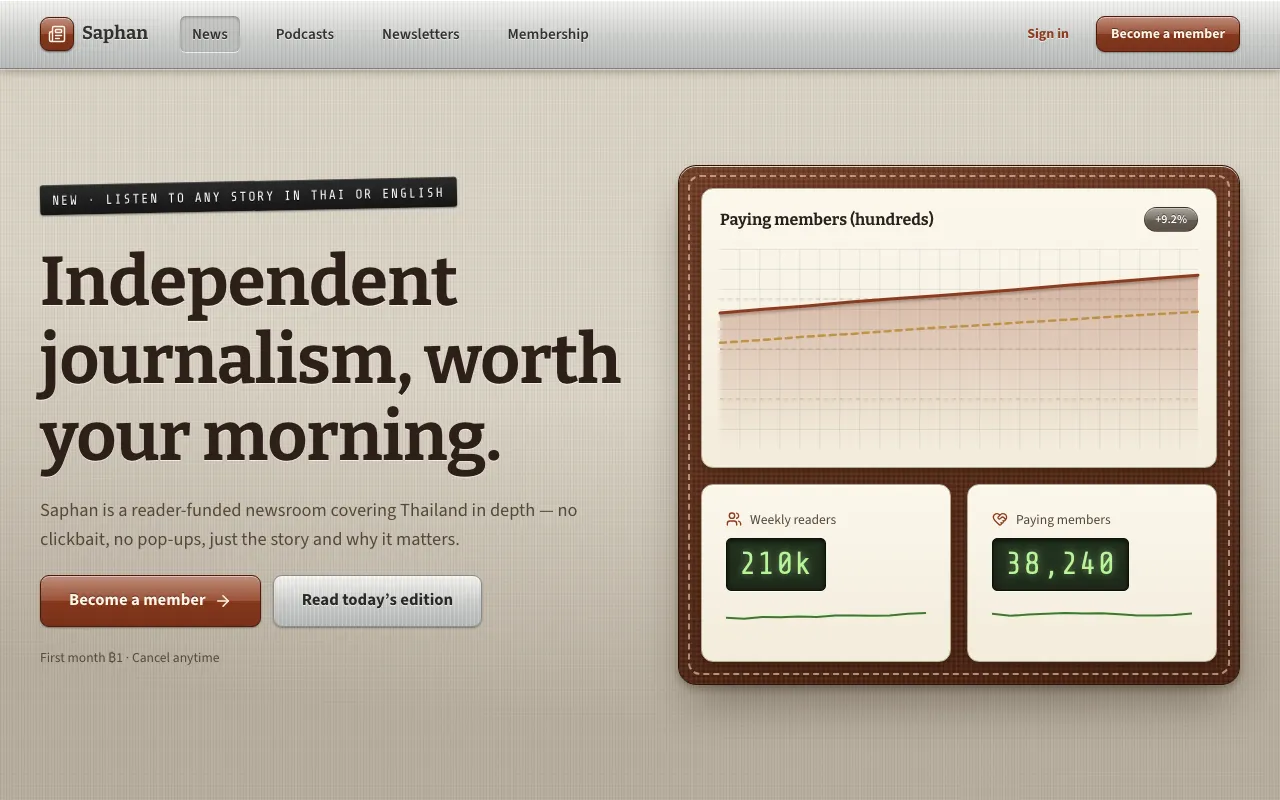
Interfaces dressed in real materials — stitched leather, brushed metal, linen, paper and glossy buttons — so every control looks like the object it replaces.
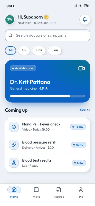
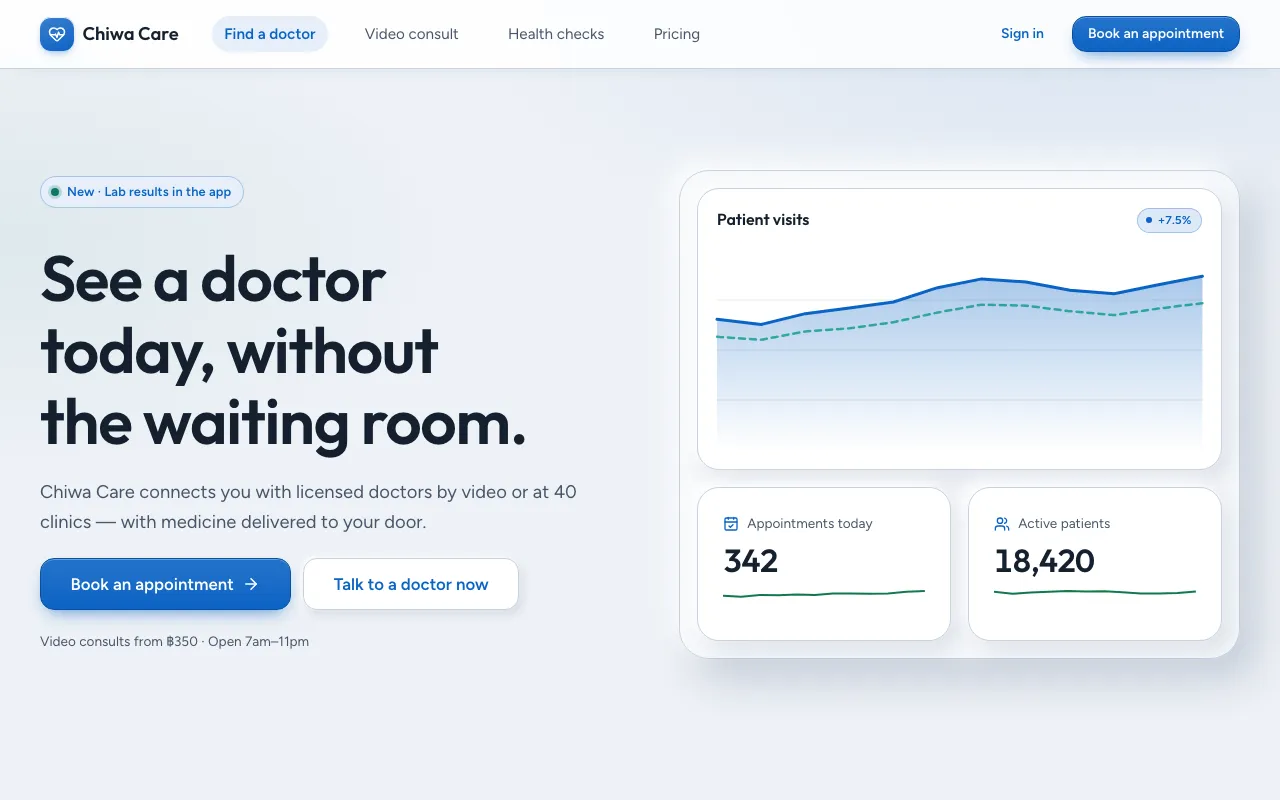
Neumorphism grown up: the same gentle dual-shadow depth, but on white cards with real borders, solid colour buttons and visible focus.
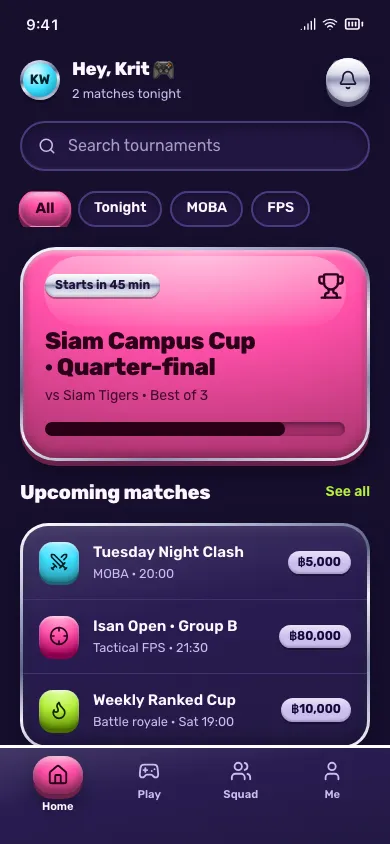
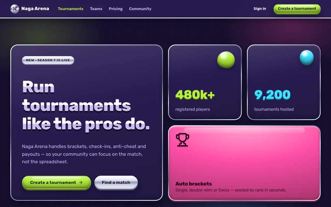
Glossy jelly controls with chrome rims that squash and stretch under your finger — UI that feels like a soft toy.
Loud colour, heavy type, attitude.
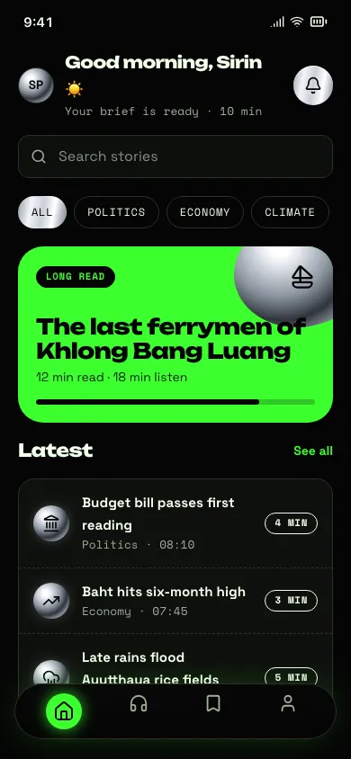
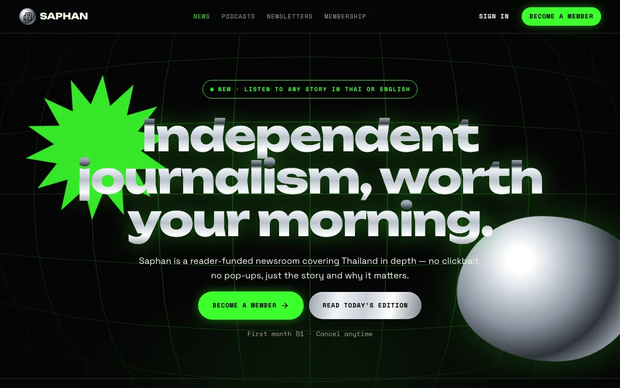
Rave-flyer energy on black: liquid chrome type, neon acid green, warped fisheye grids and spiky starbursts.
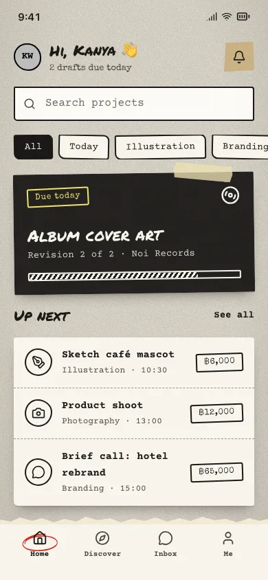
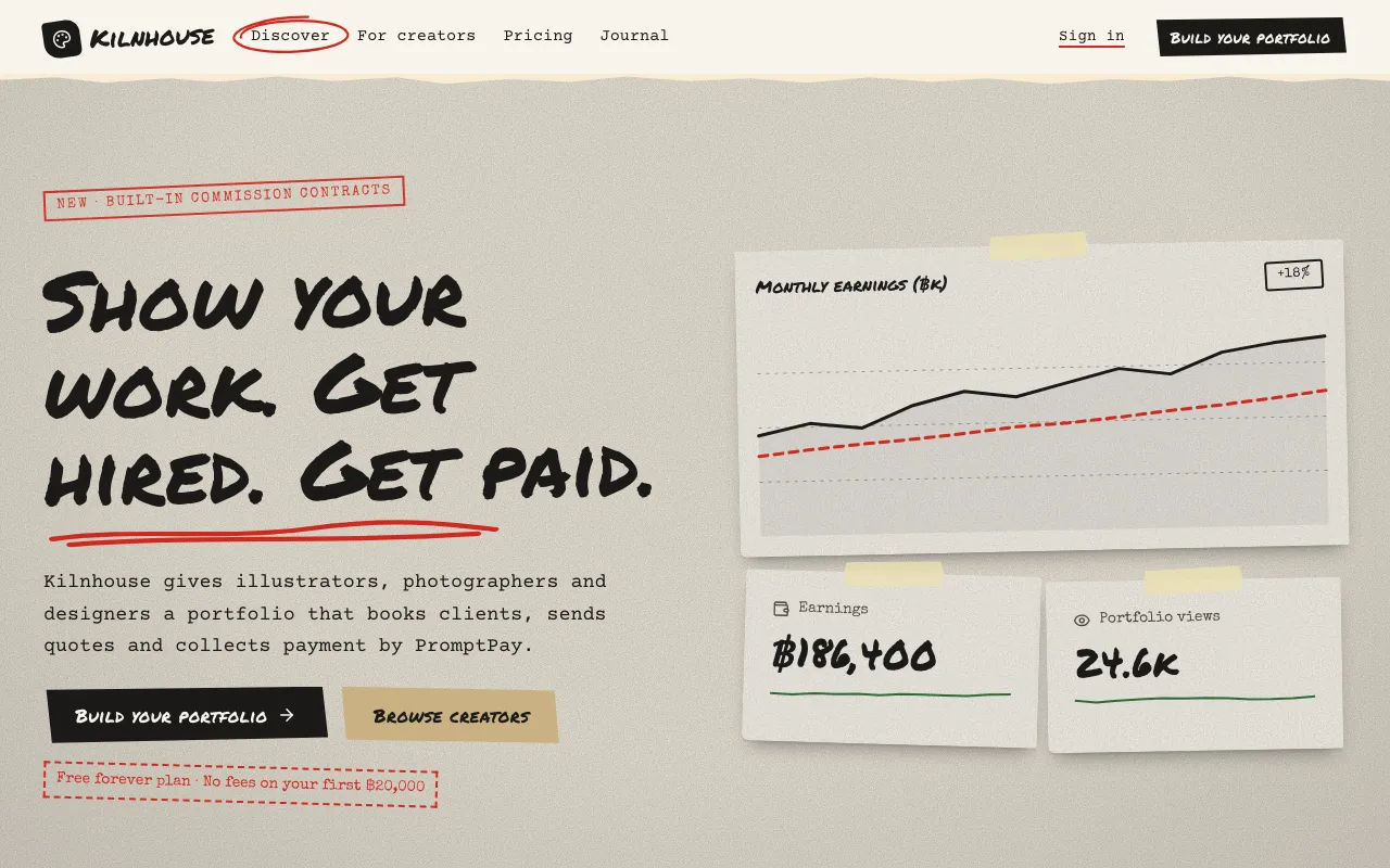
A photocopied zine: grainy recycled paper, masking tape, marker scribbles, rubber stamps and cut-out scraps placed slightly off-grid.
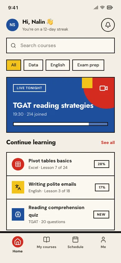
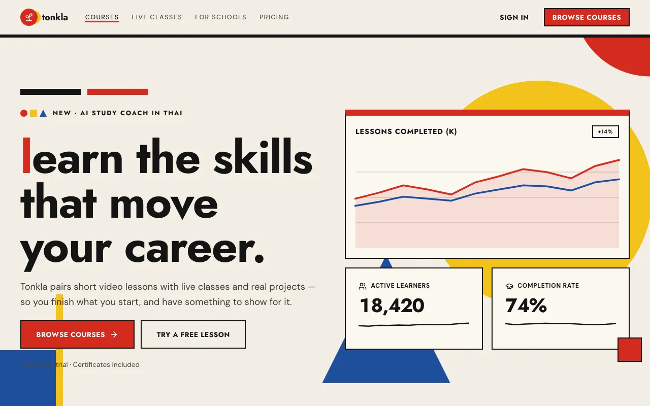
Primary red, yellow and blue with black on paper — circles, squares and triangles composed like a 1920s school poster.
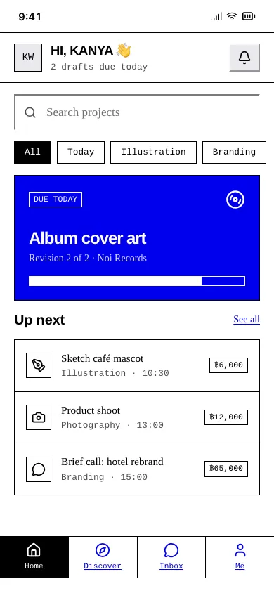
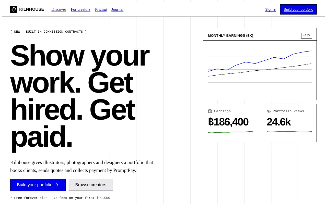
The browser’s defaults on purpose: Times and Arial, blue underlined links, 1px black boxes, grey bevel buttons and zero polish.
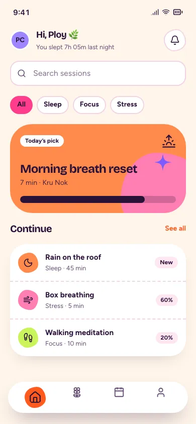
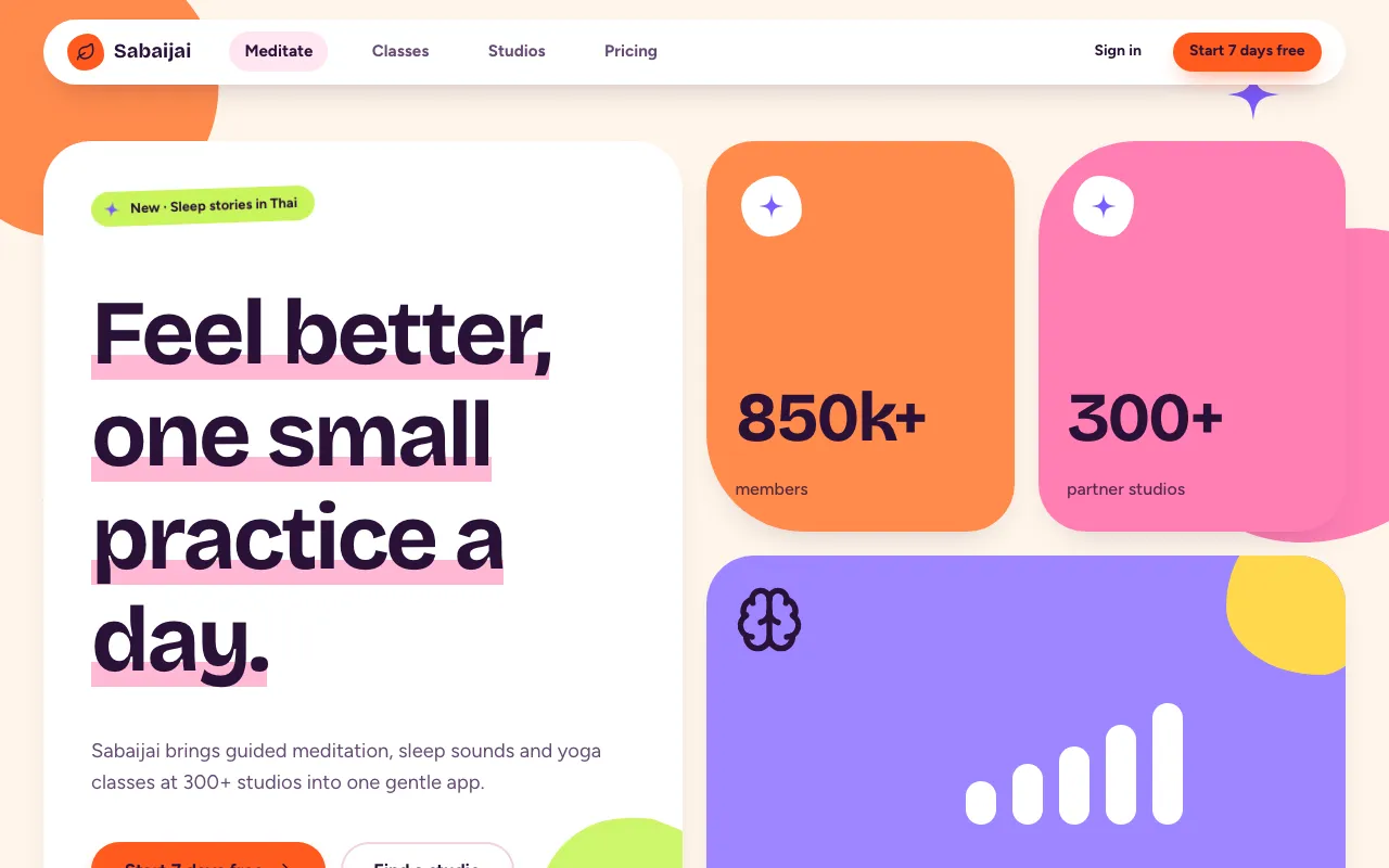
Saturated orange, hot pink and lime on warm cream — squishy blob shapes, pill buttons and bouncy micro-animations that feel like a mood boost.
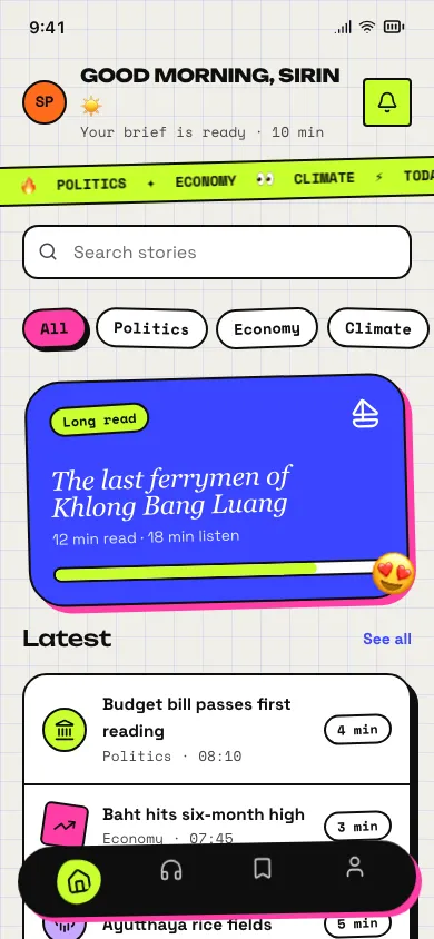
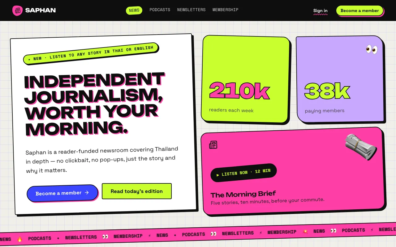
A loud collage of tilted cards, stickers, emoji, scrolling marquees and clashing fonts on graph paper — clutter on purpose.
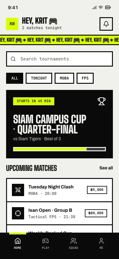
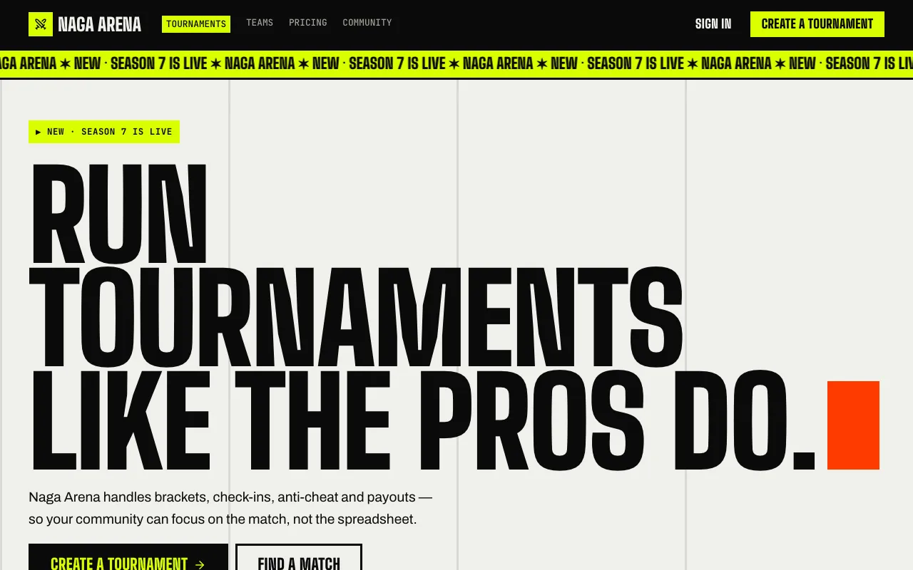
Raw brutalist structure that never sits still: huge condensed caps, scrolling ticker bands, acid accents and hard-cut inversions.
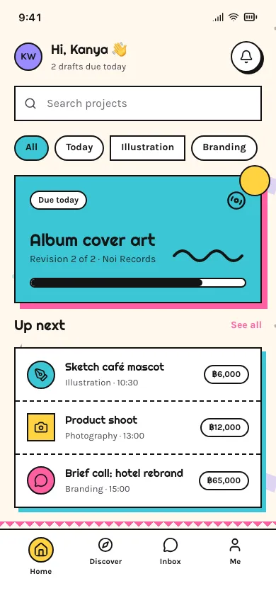
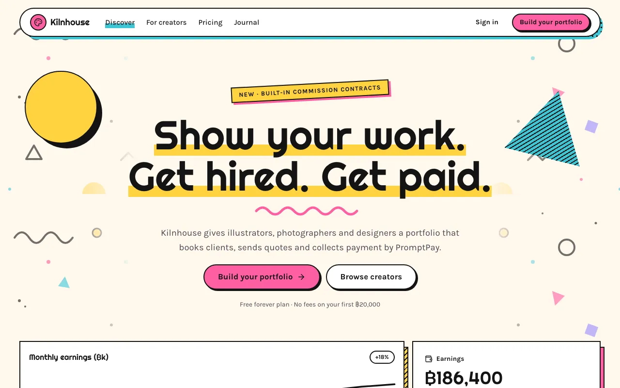
Black squiggles, confetti triangles, terrazzo dots and striped shadows over clashing pastels — the 80s Memphis Group as UI.
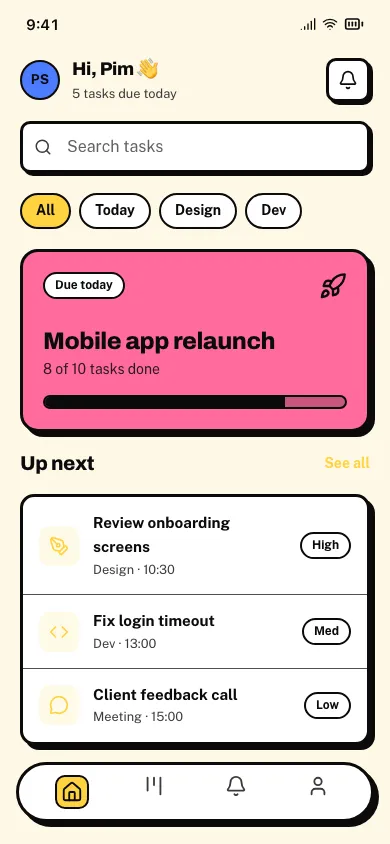
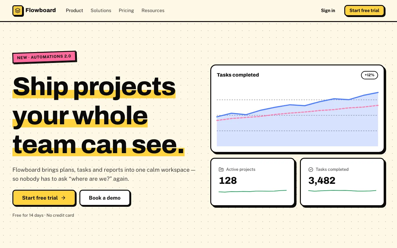
Thick black outlines, hard offset shadows and loud flat colours — brutalism made friendly.
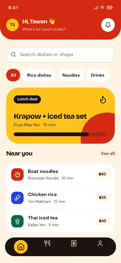
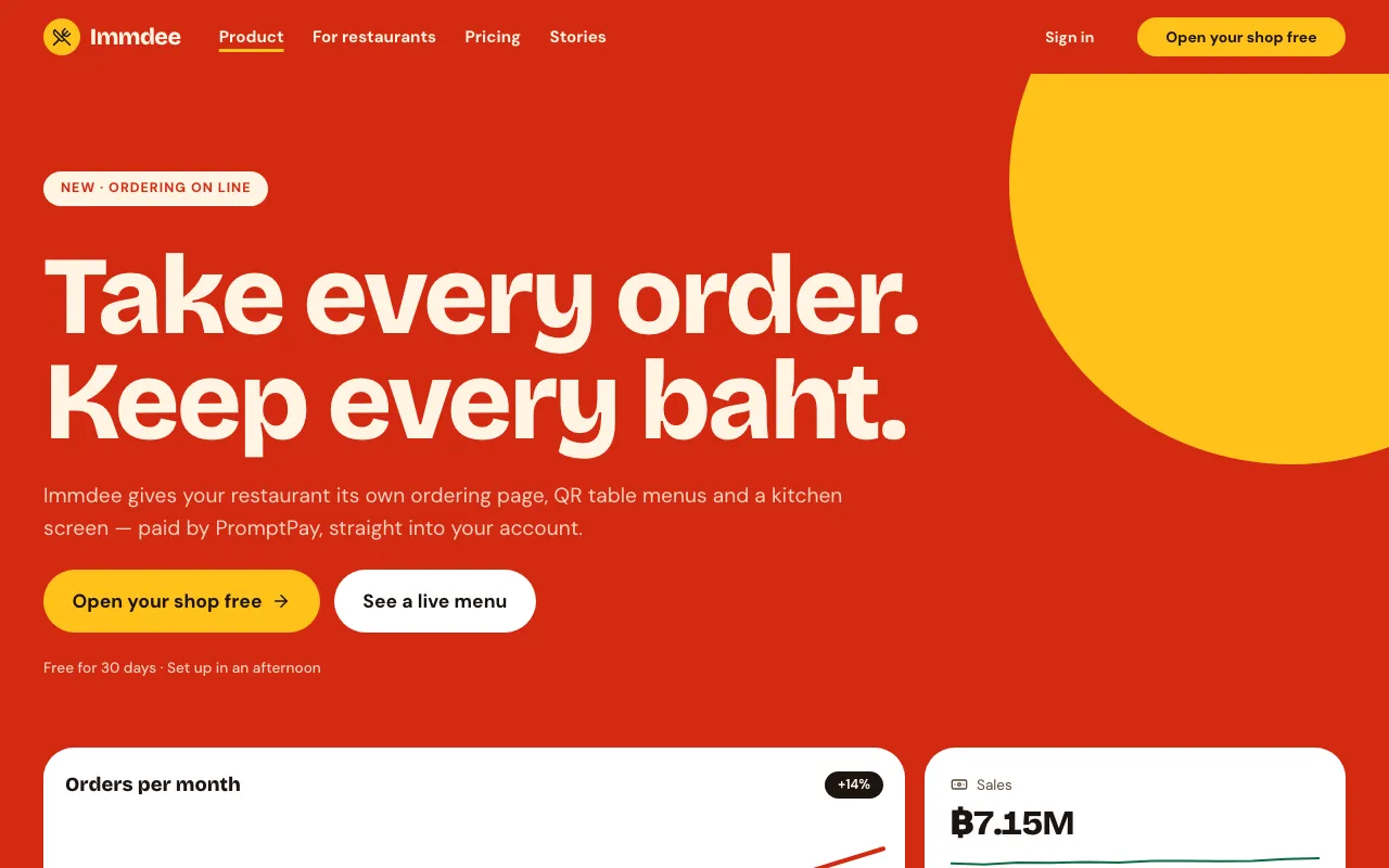
Every section is a full-bleed slab of saturated colour — tomato, mustard, green, pink, cobalt — with big geometric shapes and chunky type.
Borrowed from past decades.
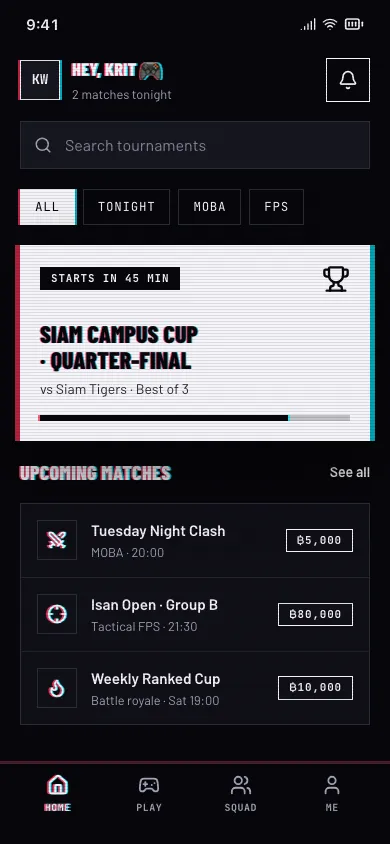
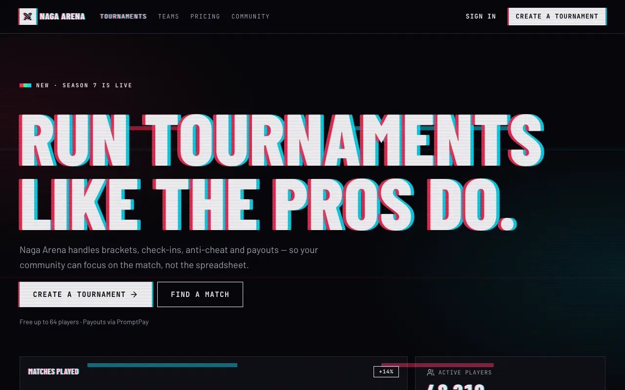
White type on near-black, with every edge split into red and cyan ghosts — scanlines, slice glitches and misaligned colour channels.
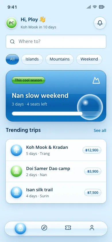
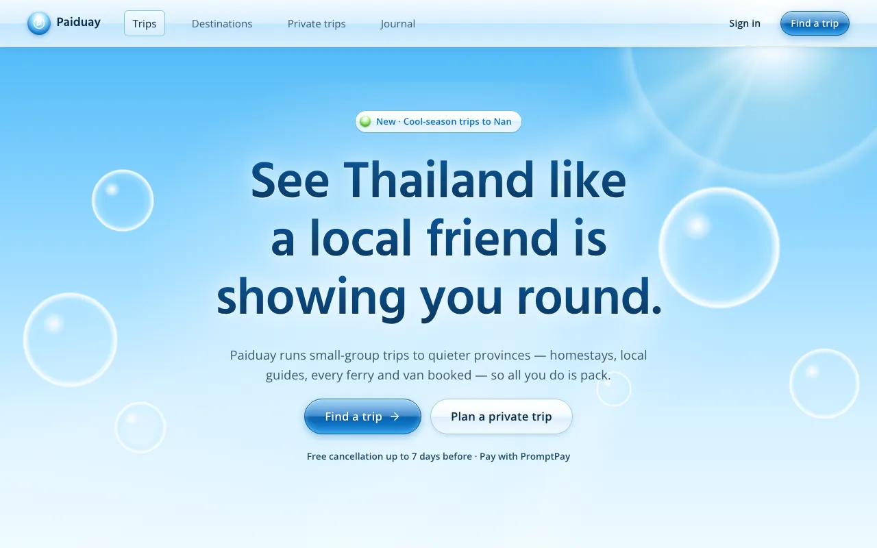
Mid-2000s glossy optimism: sky blue and grass green, water bubbles, aqua gel buttons, lens flares and a friendly humanist sans.
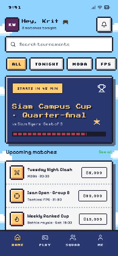
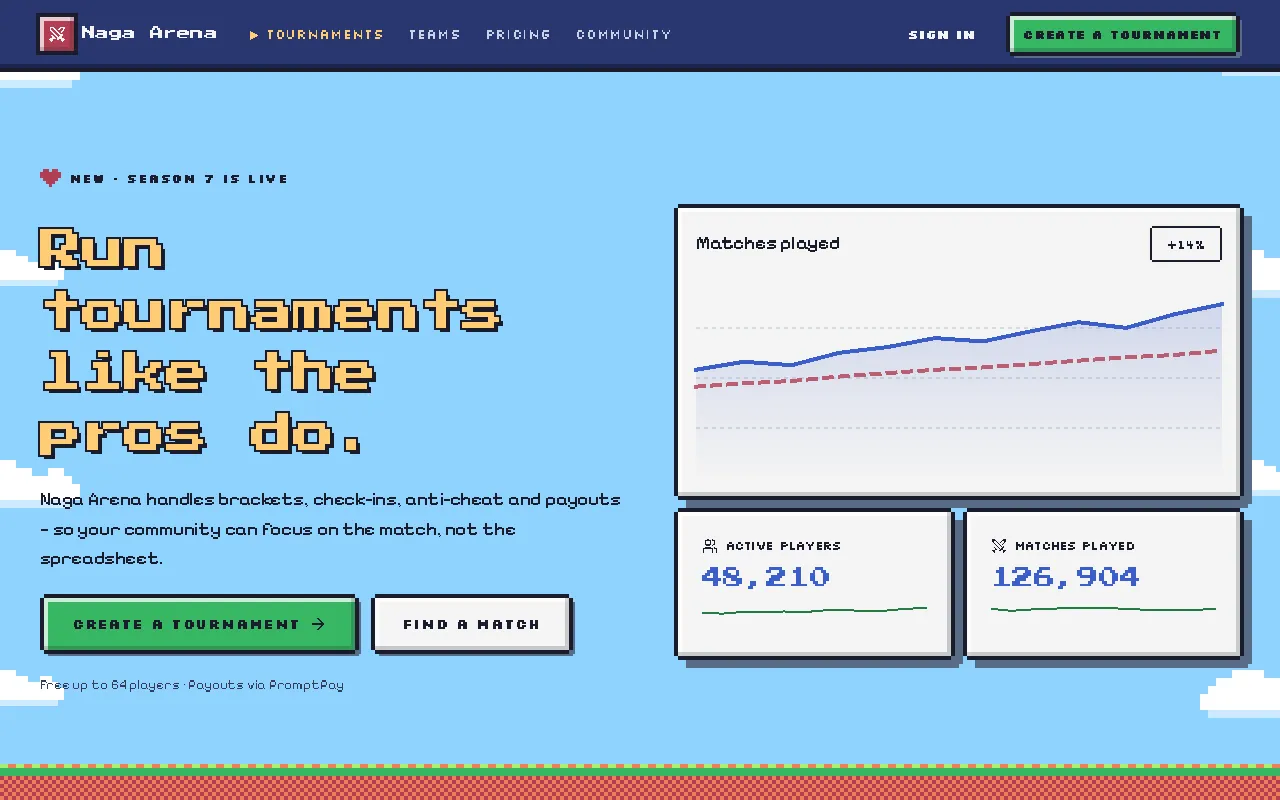
A console game as an interface: pixel fonts, notched pixel borders, a 16-colour palette, chunky bevels and blocky sprites on a sky-blue level.
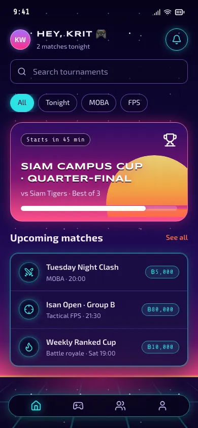
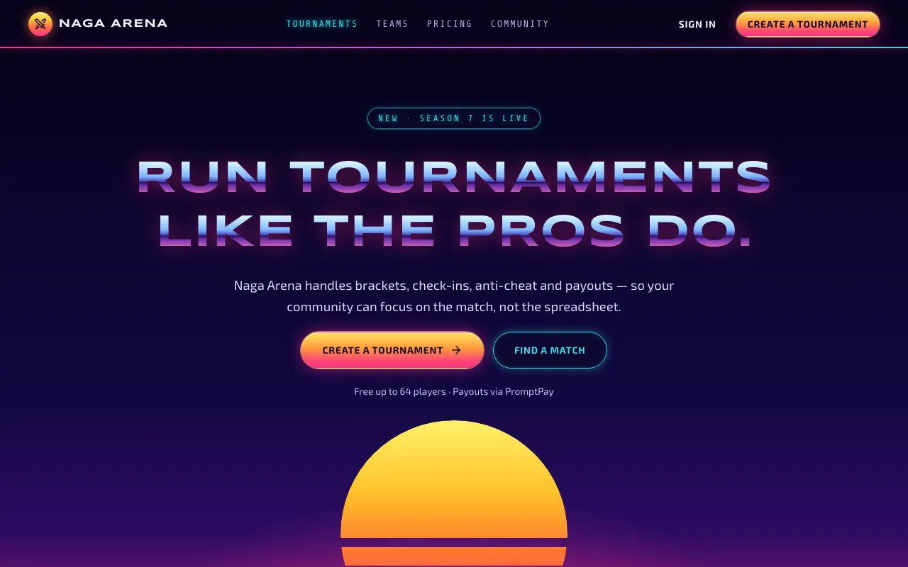
The future as the 80s imagined it: chrome lettering, a striped sunset over a neon grid, and glowing outline panels on a midnight sky.
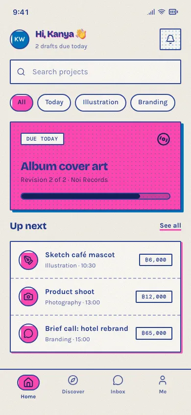
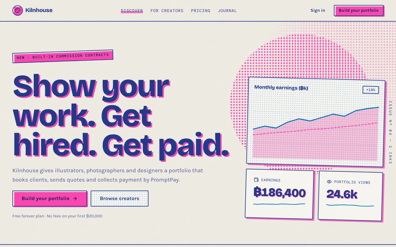
Two inks only — fluoro pink and blue — on off-white paper, with grain, halftone dots, overprint and slightly misregistered layers.
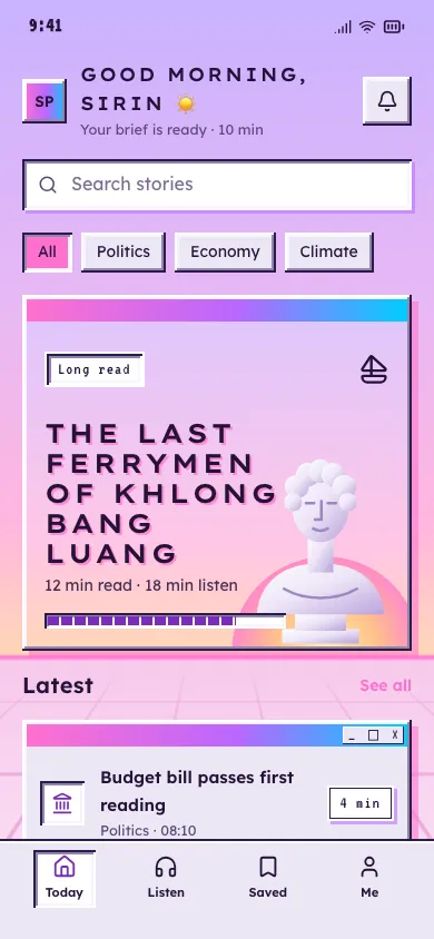
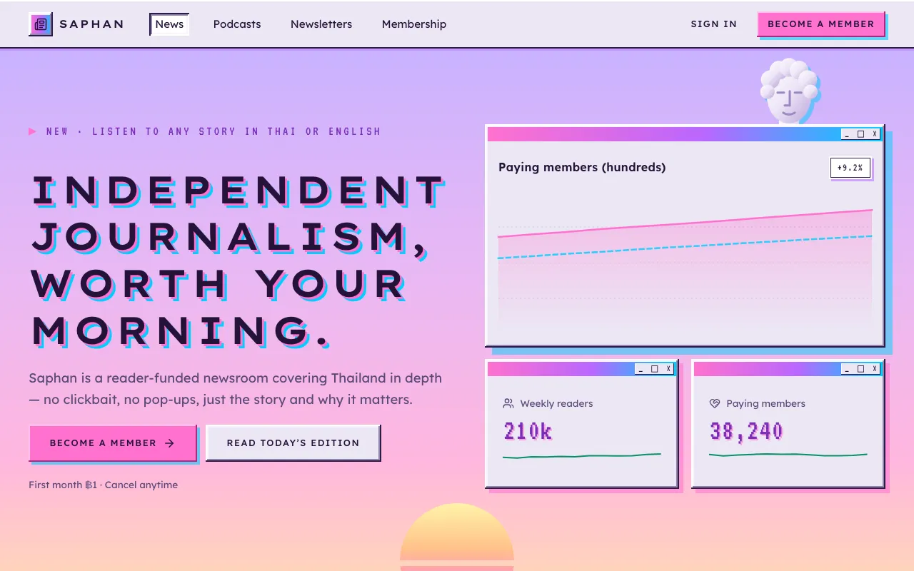
A dreamy pastel sunset, Windows-95 windows with candy title bars, marble statues on a grid floor and wide-spaced capitals.
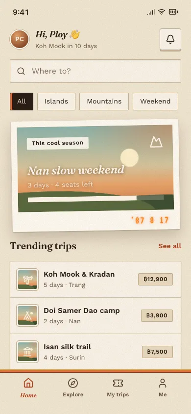
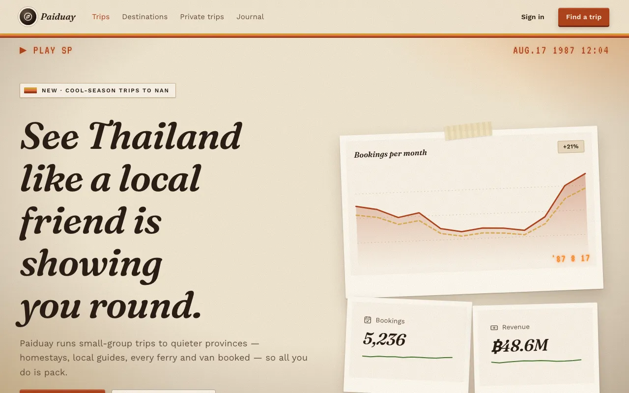
Faded warm film colour, grain, polaroid frames, orange date stamps and cassette-label stripes — a UI that feels developed, not rendered.
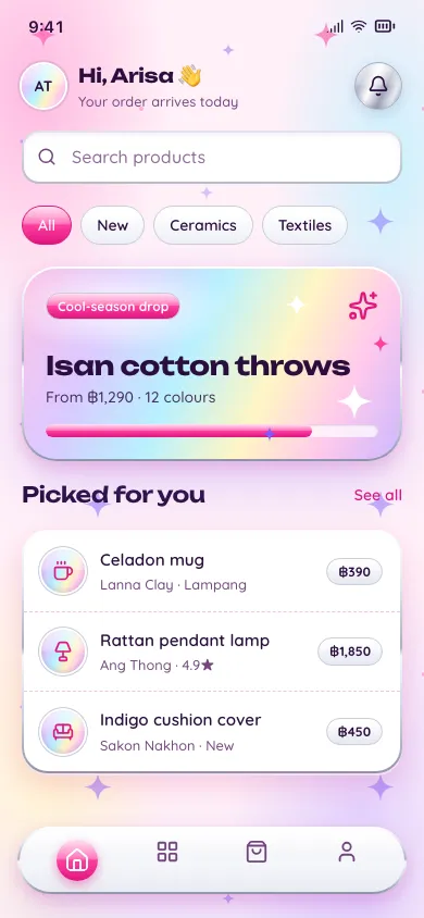
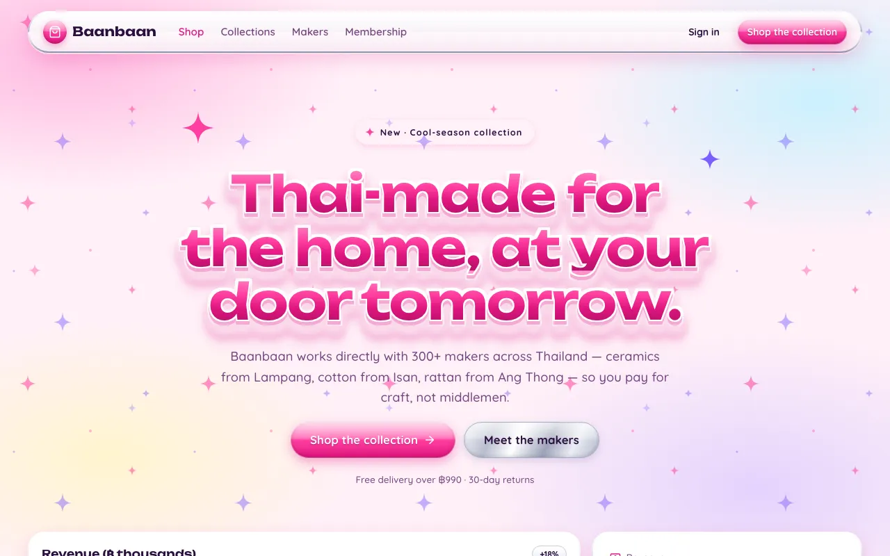
Millennium pop: bubblegum pink, liquid chrome, holographic foil, twinkling star sparkles and glossy candy pills.
Glow, light, sci‑fi and AI.
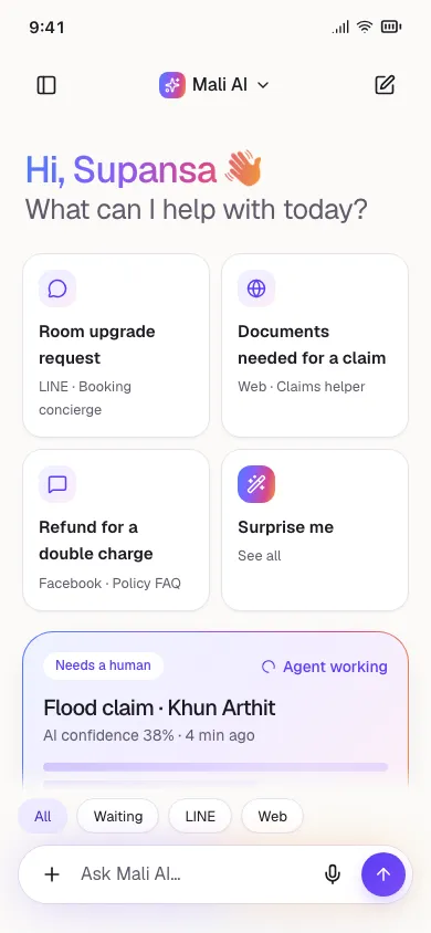
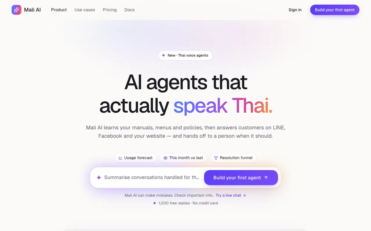
The prompt bar is the hero: a calm white canvas, a glowing composer, streaming answers, sparkle accents and agent cards.
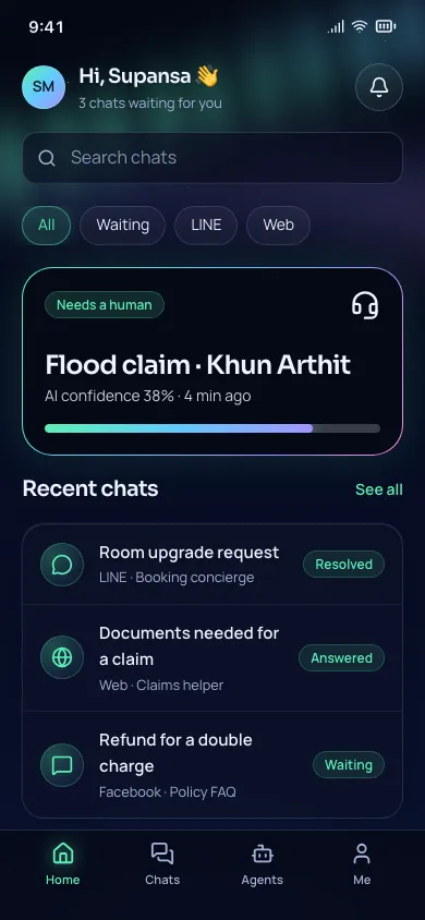
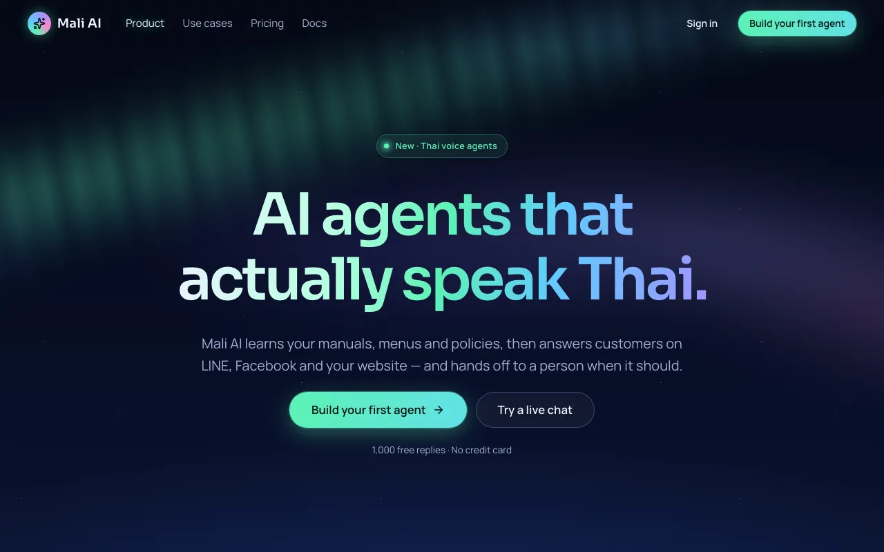
Slow, blurred ribbons of green, teal and violet light drift behind a calm night-sky UI — the background is the brand.
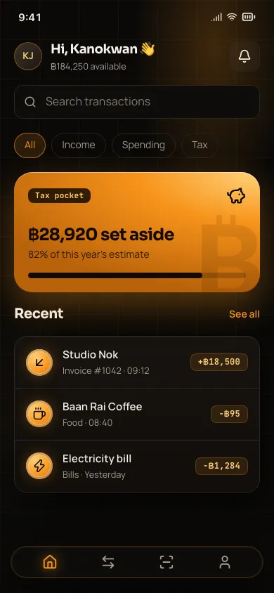
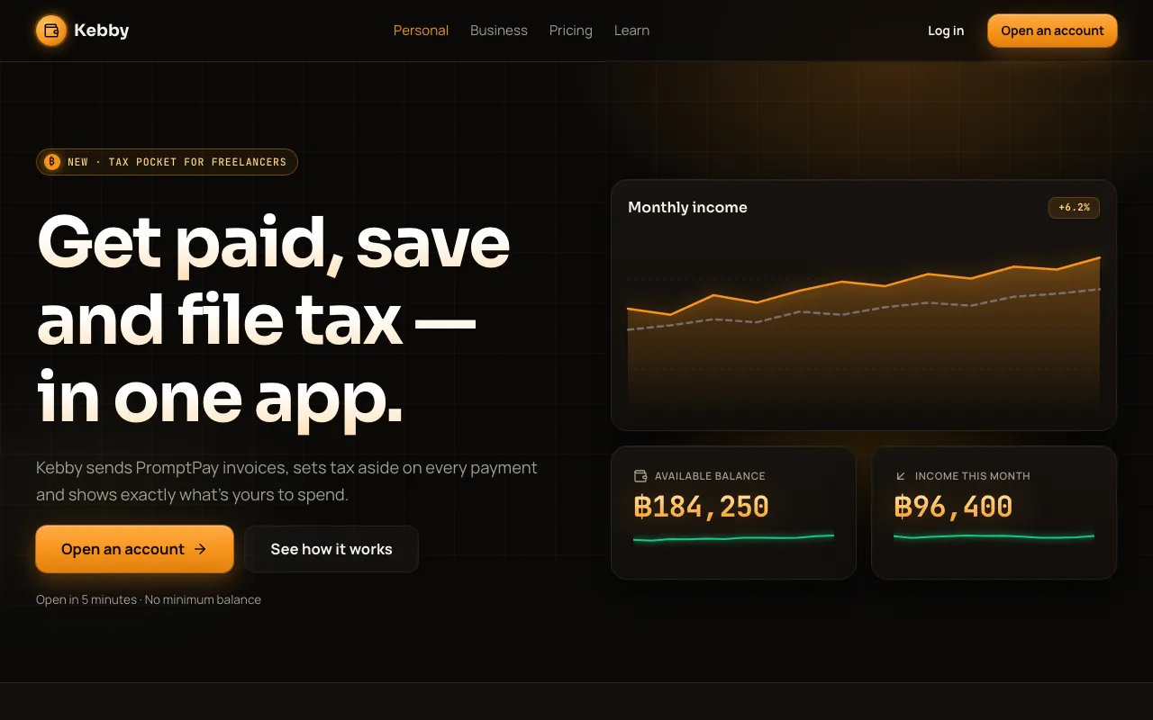
Bitcoin orange on deep warm black: glowing gold numbers, coin-shaped icons, candlestick charts and trust badges everywhere.
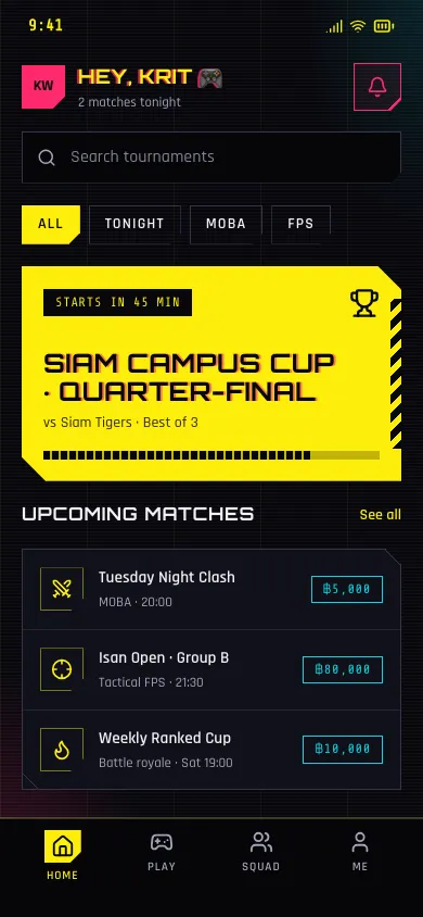
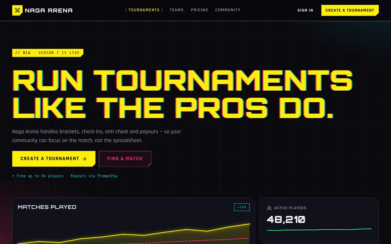
Acid-yellow and hot-magenta neon on near-black, chamfered corners, glitch-split headlines and terminal labels — high-tech, low-life.
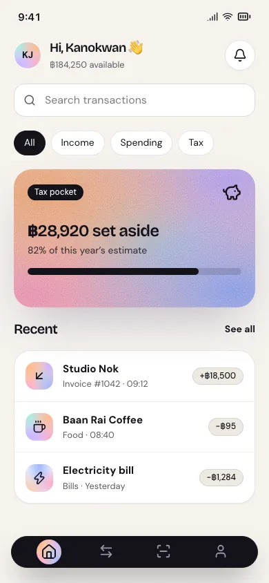
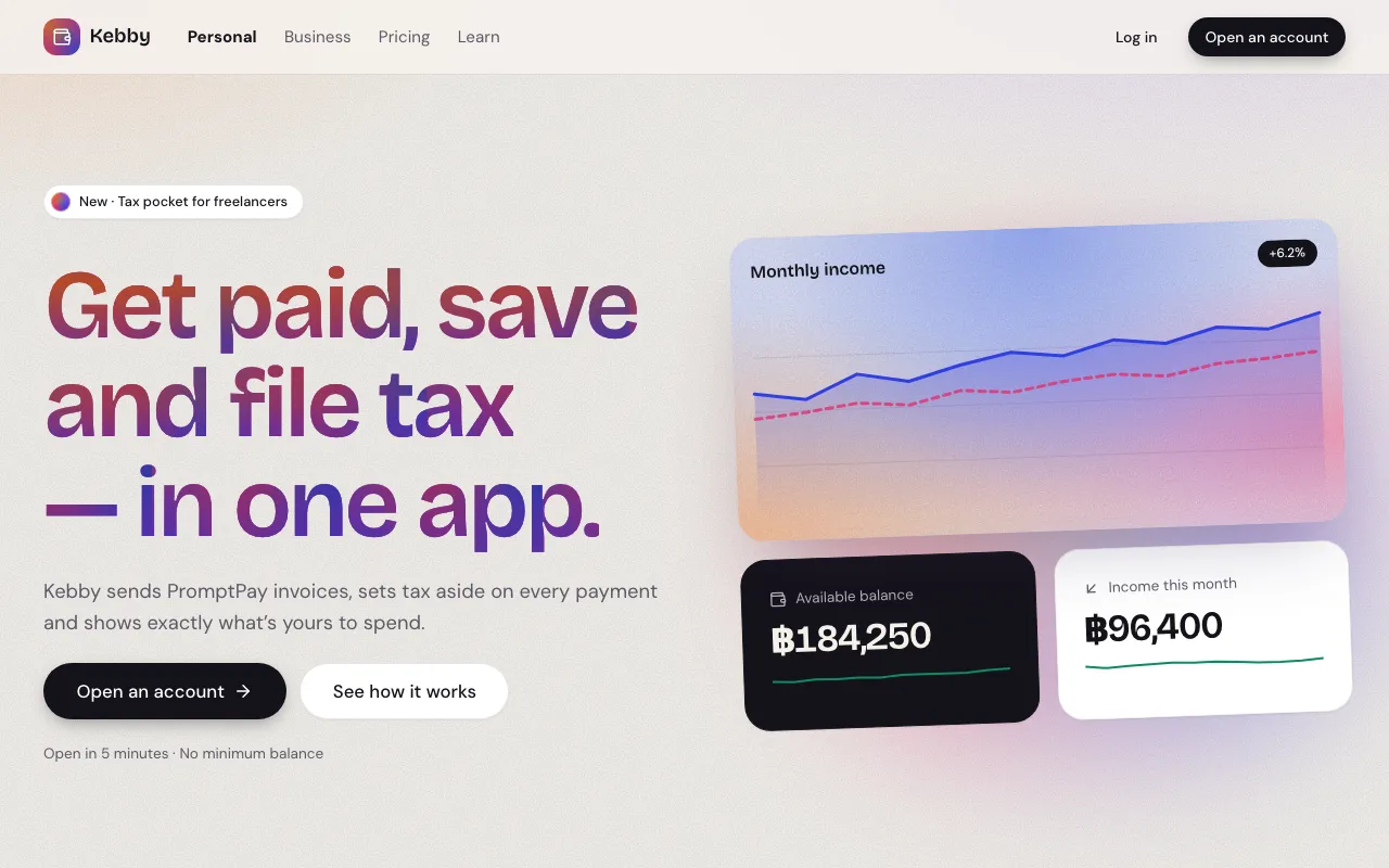
Multi-point mesh gradients with film grain, poured into cards, headlines and payment cards on a calm paper-white page.
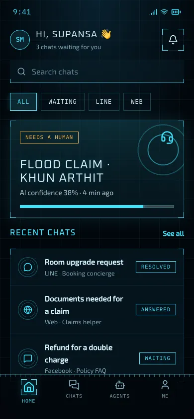
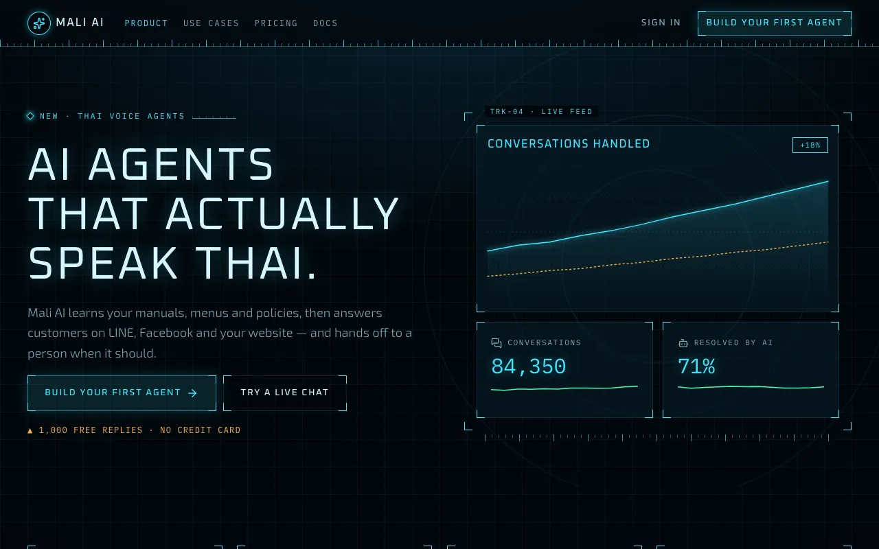
Thin cyan wireframes, corner brackets, tick-mark rulers and live mono readouts on deep blue-black — a film-prop cockpit display.
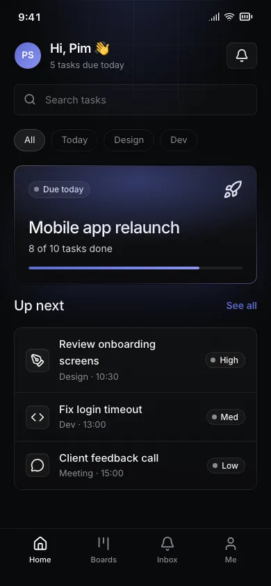
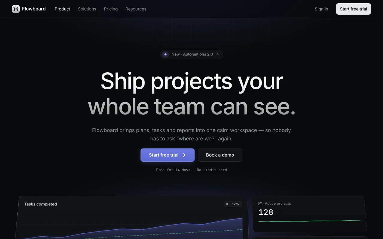
Precise near-black product UI: hairline borders, a faint indigo spotlight, gradient-edged highlights and tight medium-weight Inter.
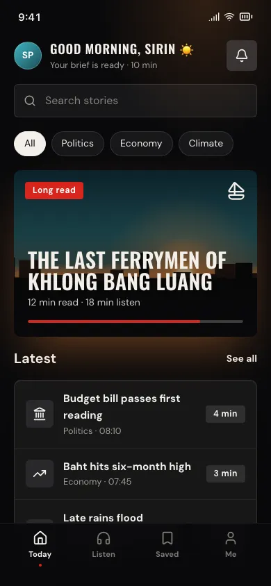
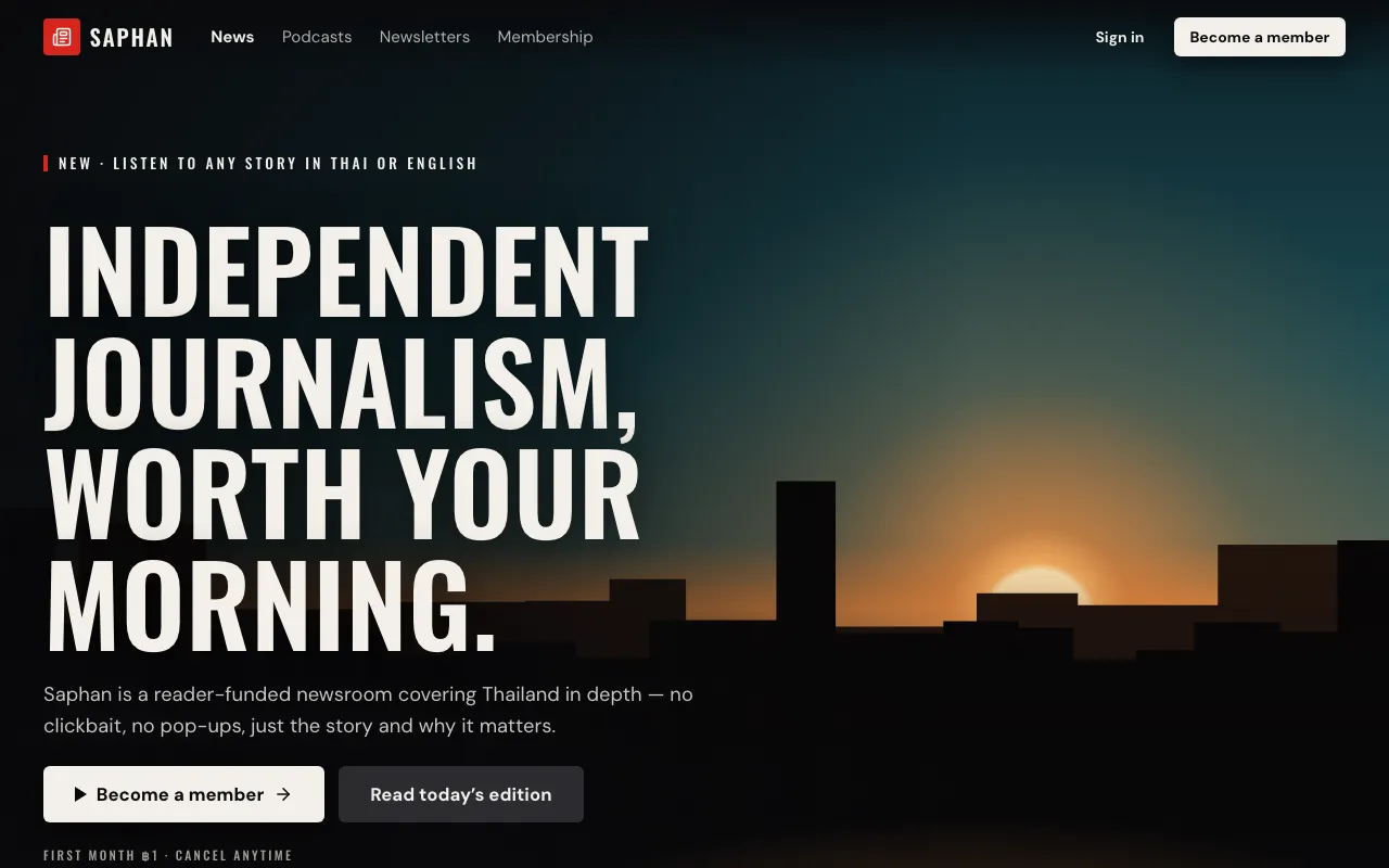
A dark theatre for content: full-bleed key art, colour that bleeds from imagery onto the page, film grain, subtle glass and tall poster type.
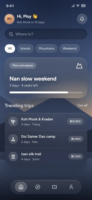
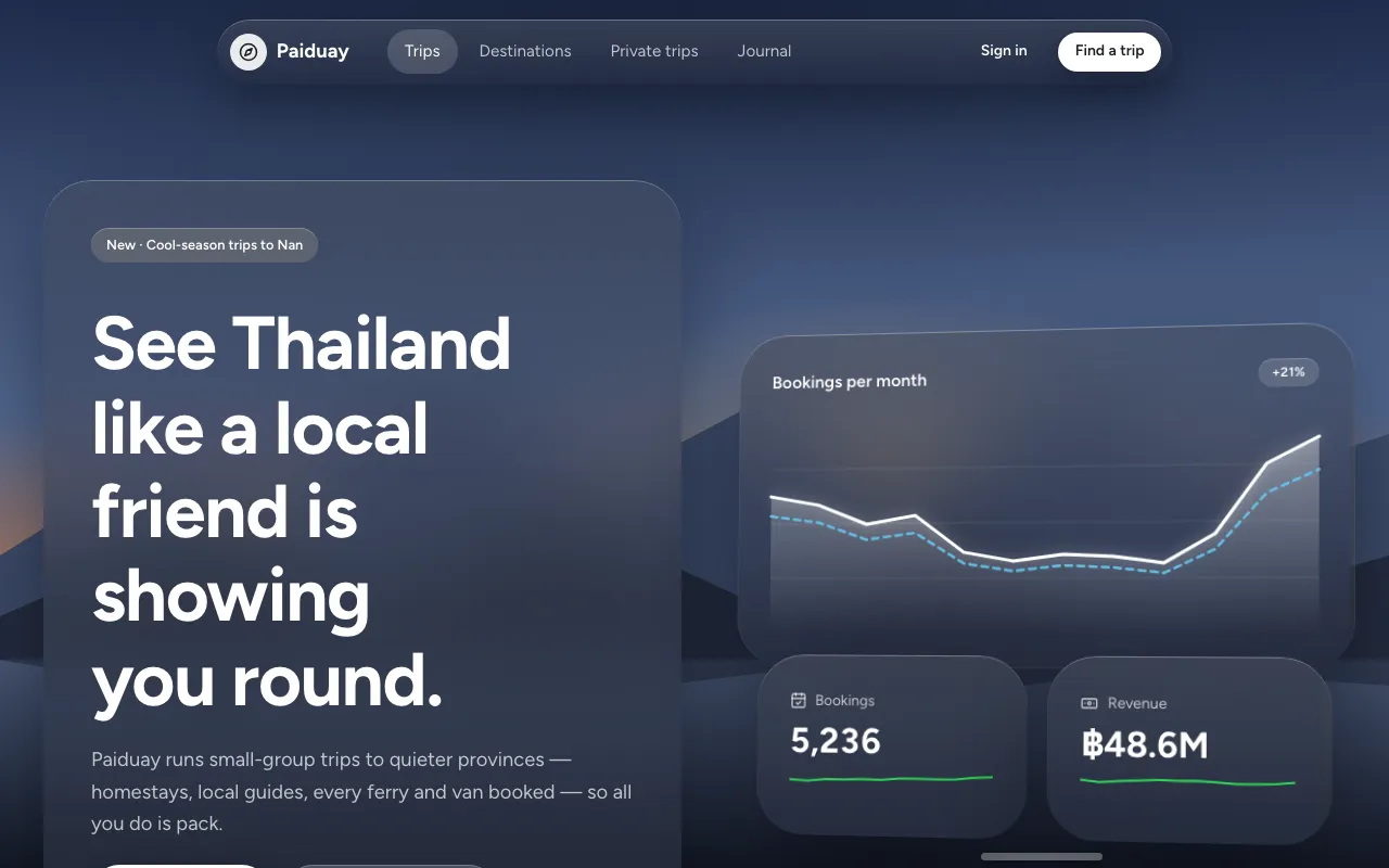
Neutral frosted-glass windows floating in a real environment, with huge rounded corners, capsule controls and detached ornaments.
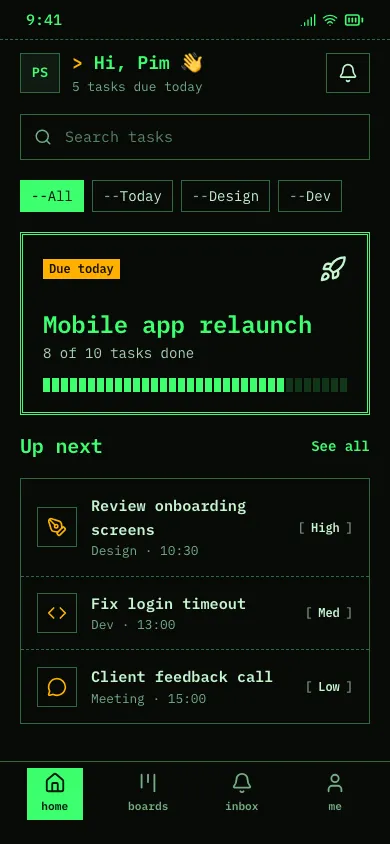
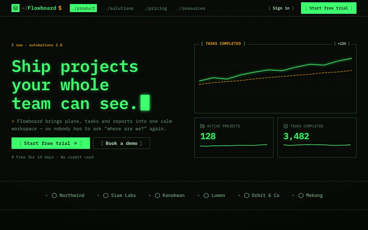
Monospace everything, phosphor green and amber on black, prompt symbols, bracketed buttons and ASCII-boxed panels with a blinking cursor.
Earthy, calm, human.
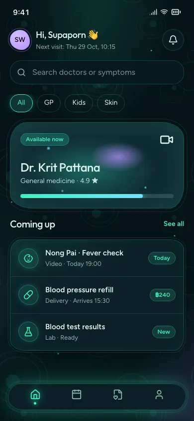
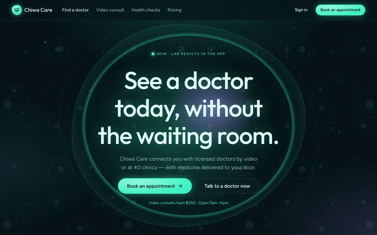
Cell-like surfaces with double membranes that slowly breathe, glowing bioluminescent teal and violet on a deep-sea dark ground.
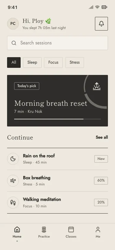
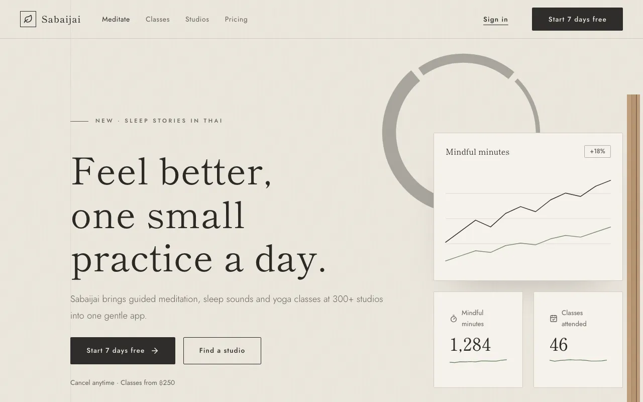
Japanese restraint meets Scandinavian warmth: oat paper, charcoal ink, muted sage, hairlines, enso circles and slatted wood — balanced off-centre, with lots of air.
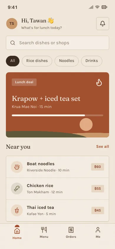
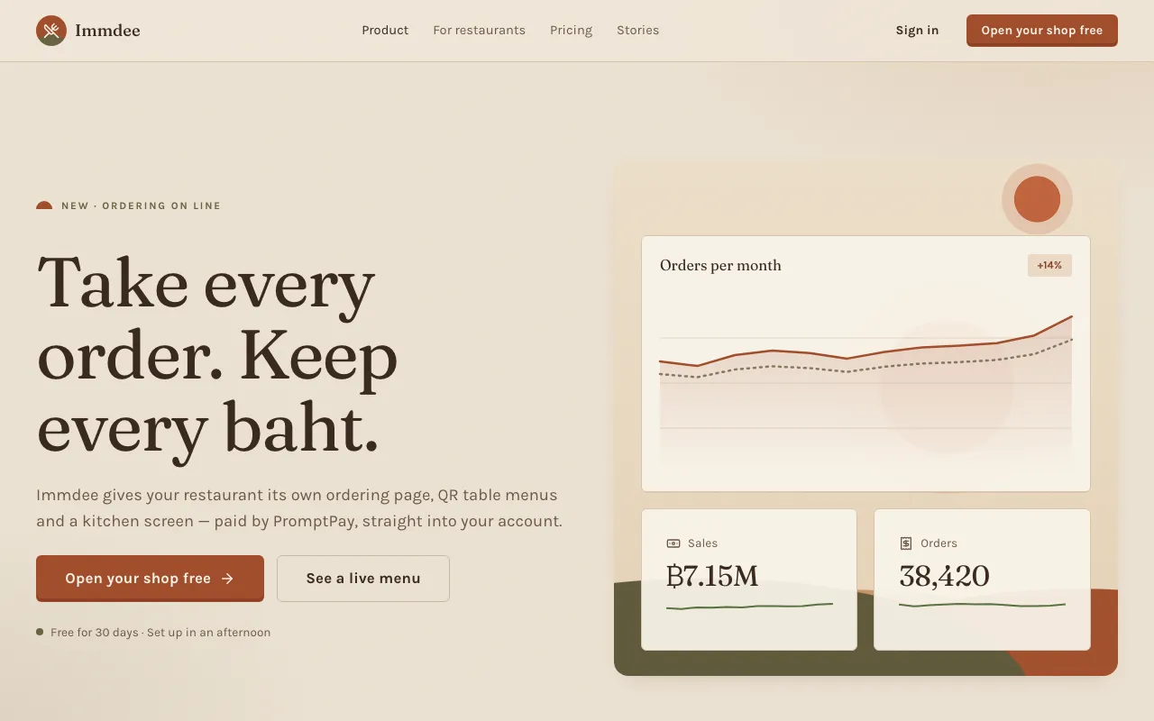
Nature reduced to calm earth tones — clay, sand, olive and terracotta on grainy paper, with a soft serif and abstract sun-and-dune forms.
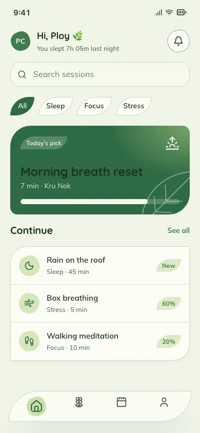
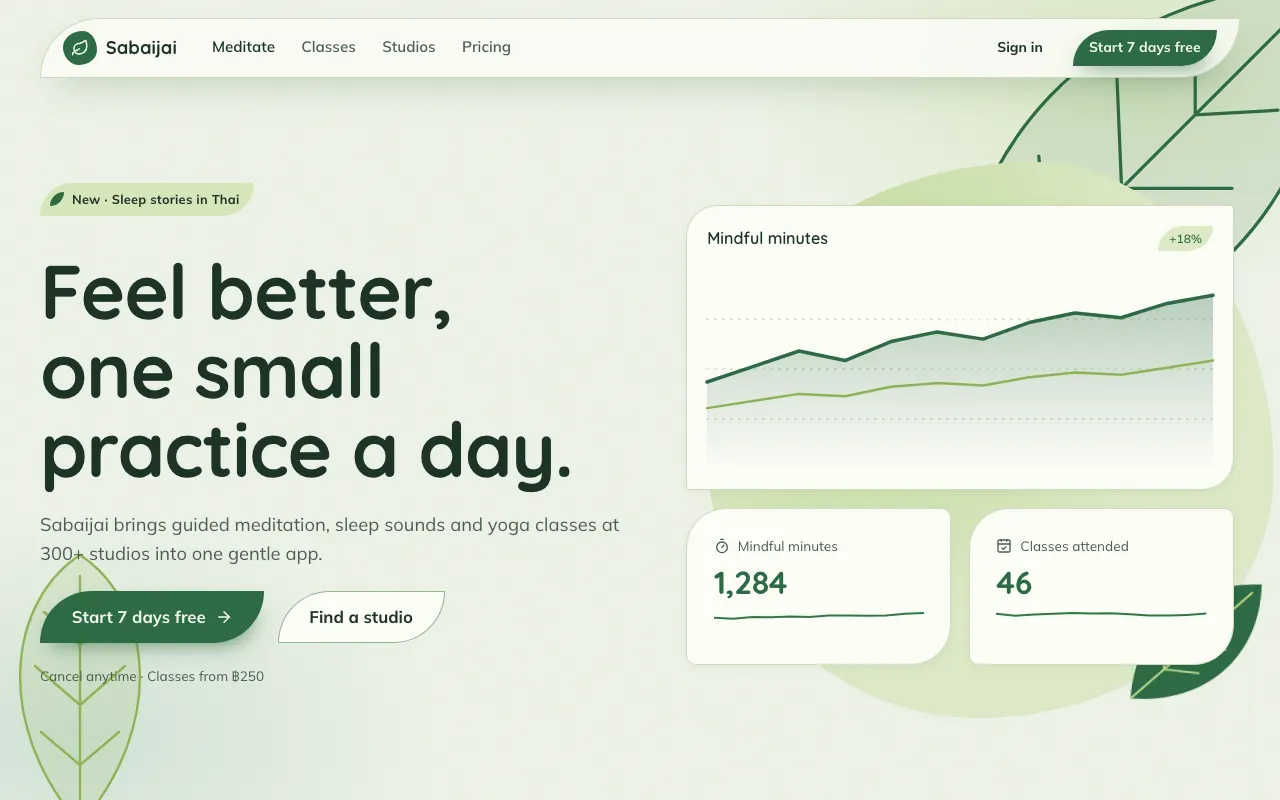
Leaf greens, blob shapes and petal-cornered cards on a fresh, lightly textured ground — interfaces that feel planted, not built.
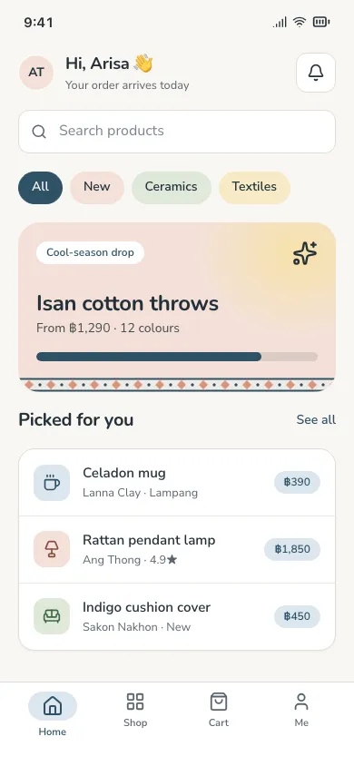
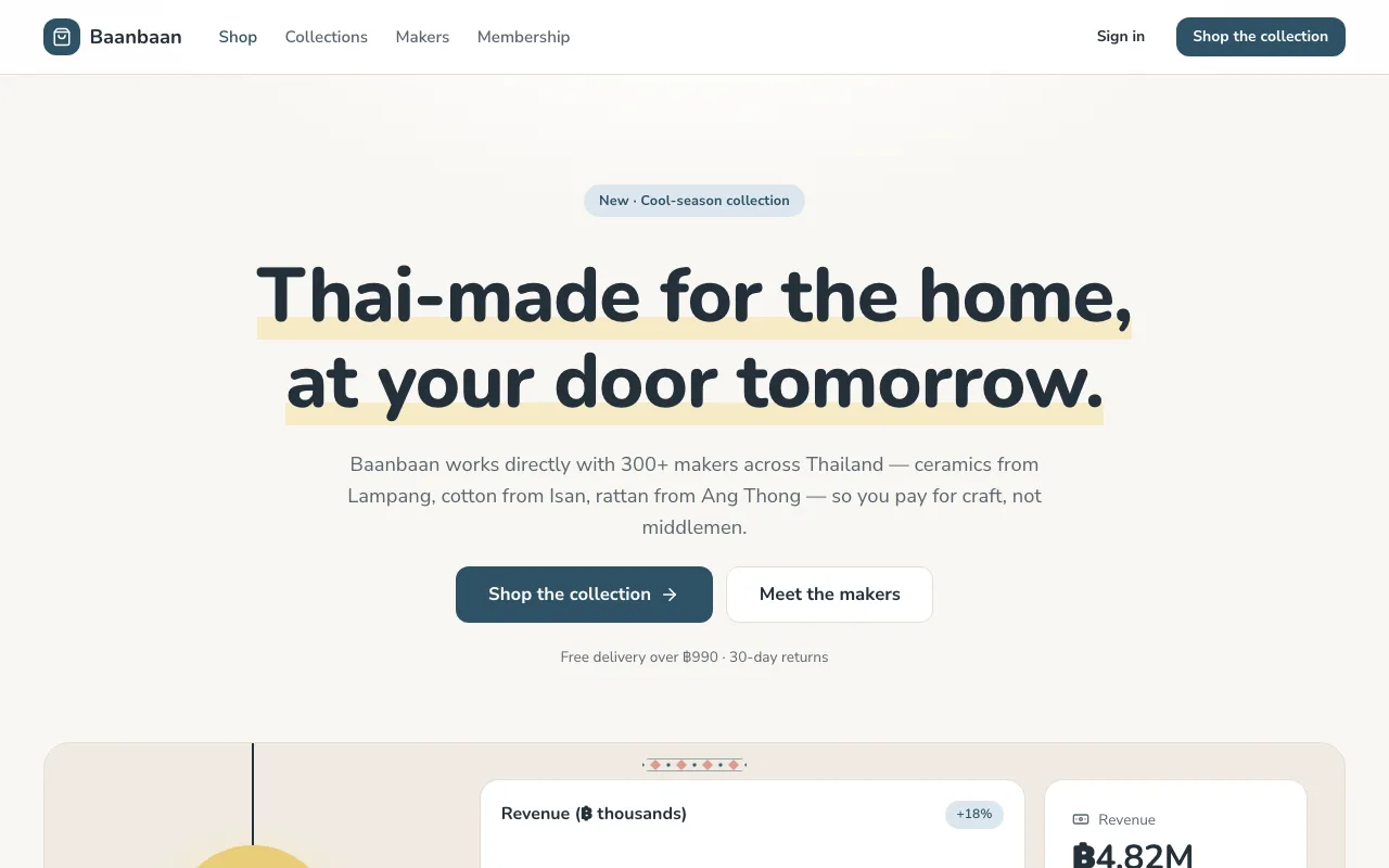
Bright birch-white rooms, muted pastel accents and friendly rounded type — simple, functional cards that feel cosy rather than clinical.
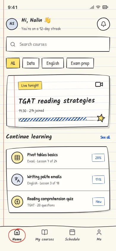
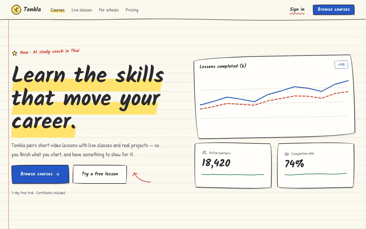
Wobbly pencil outlines, handwriting fonts, ruled notebook paper, highlighter marks and doodled arrows — UI that looks drawn by hand in class.
Type and grid do the talking.
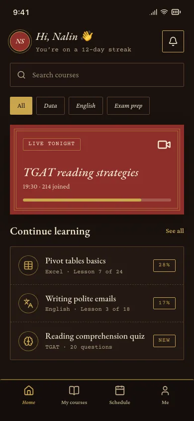
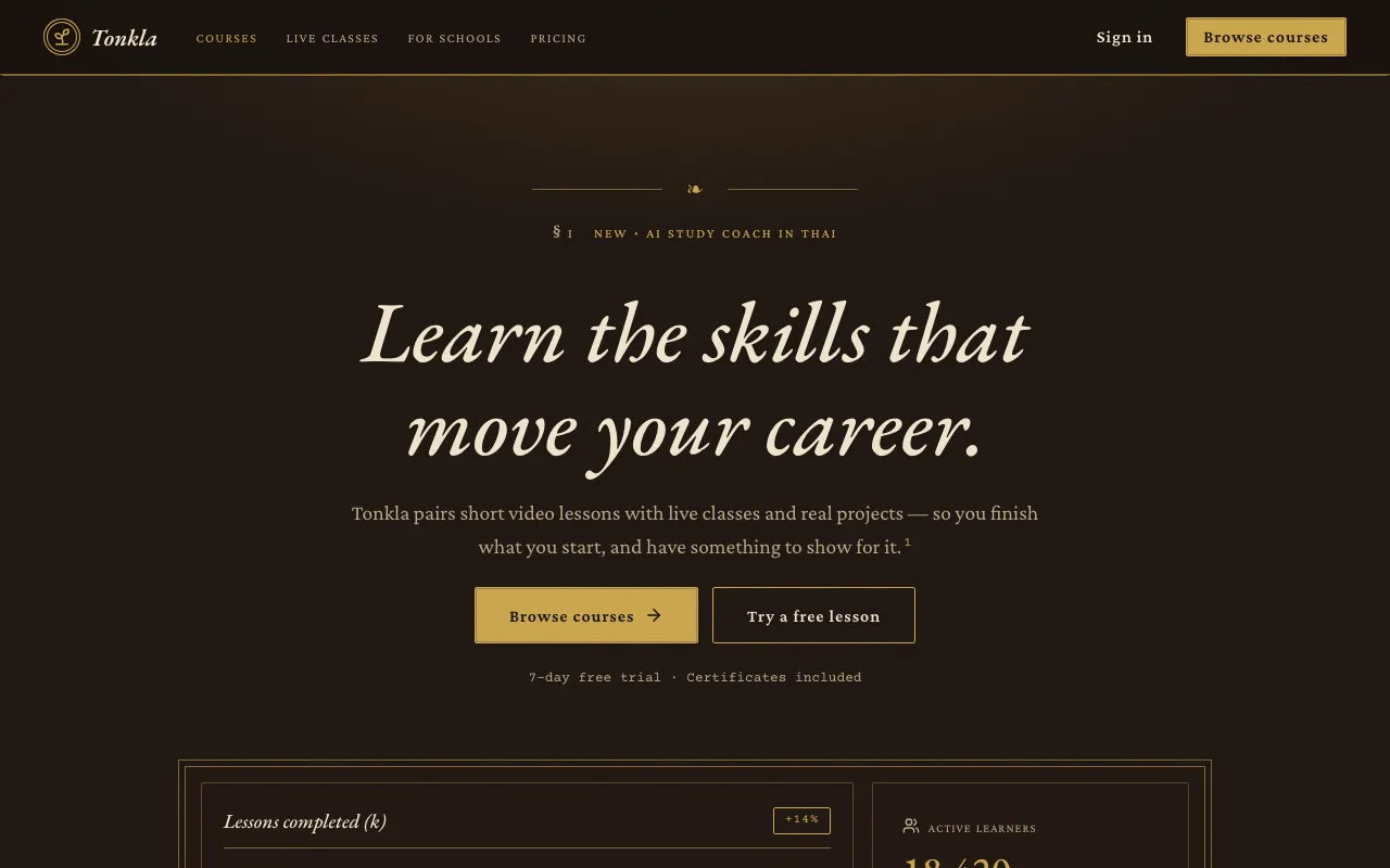
A lamp-lit library: mahogany and parchment, gold-leaf rules, classic Garamond, footnotes, roman numerals and library catalogue cards.
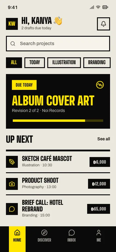
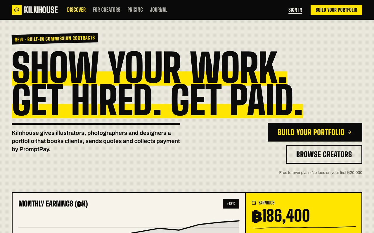
Every screen is a printed poster: one enormous condensed word, black ink on newsprint, a yellow highlight and almost no imagery.
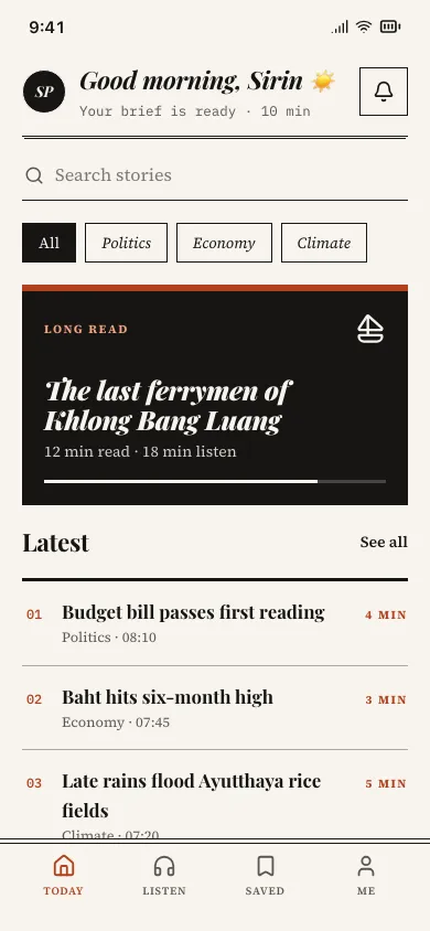
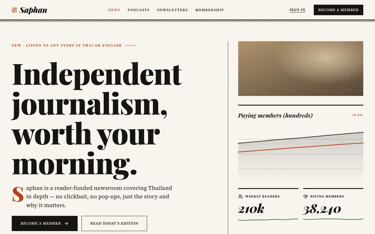
A printed magazine on screen: big serif headlines, drop caps, pull quotes, captions, column rules and asymmetric lead-story grids.
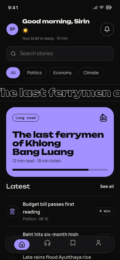
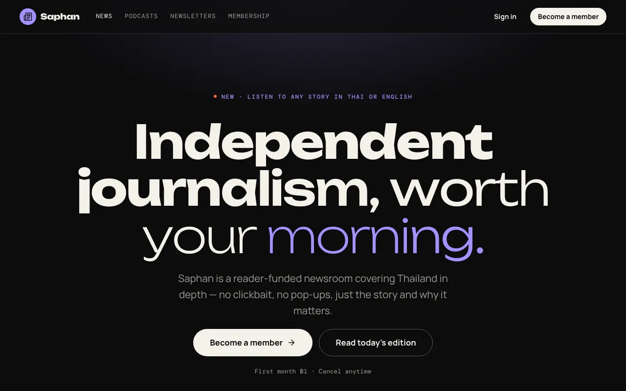
Type is the moving image: headlines reveal letter by letter, weights breathe on a variable font and marquee bands scroll — with a calm static fallback.
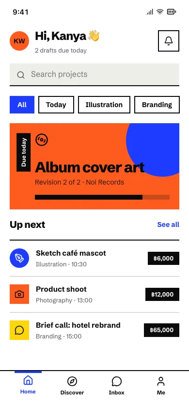
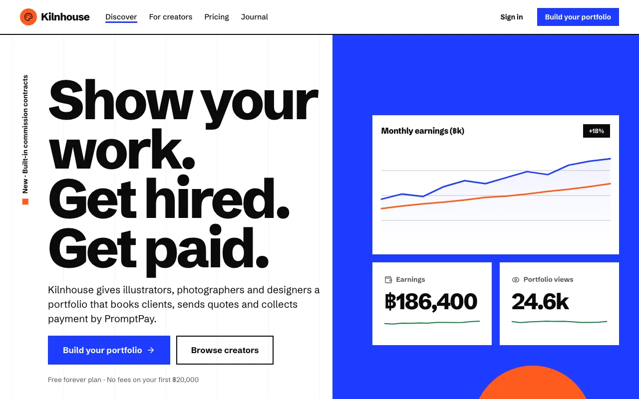
The Swiss grid with the volume up: flat fields of ultramarine, orange and yellow, giant tight grotesque, rotated labels and off-axis layouts.
Motion, cursor, voice and gesture.
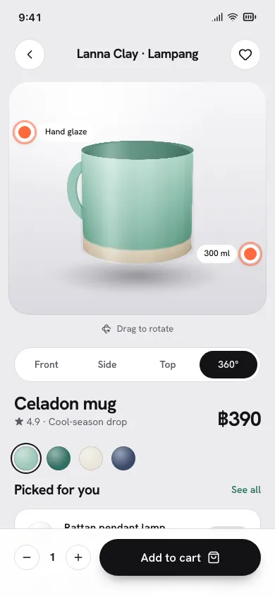
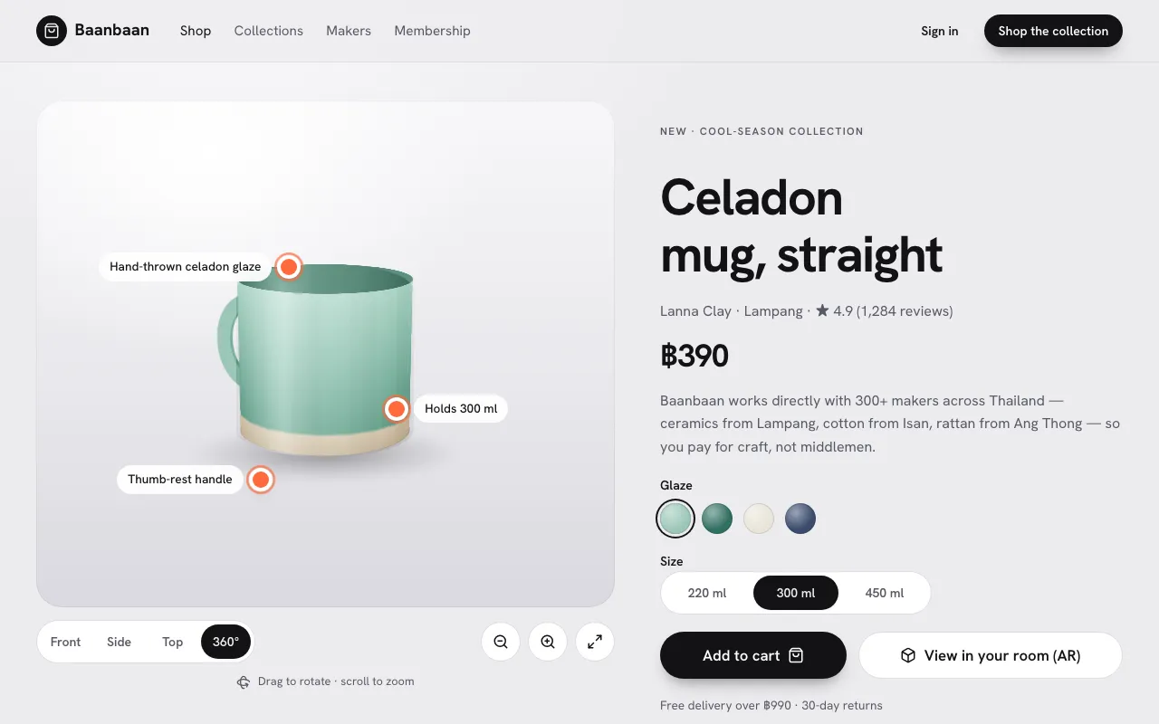
The product spins on a lit studio turntable you can drag, zoom and switch angles on, with hotspots that explain each detail.
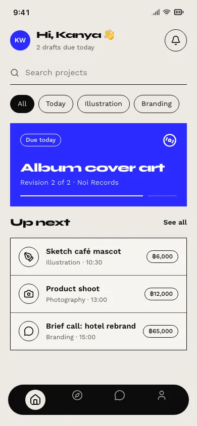
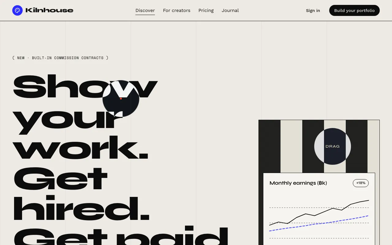
The pointer becomes the star: an inverting cursor blob that grows and labels what it touches, magnetic buttons and spotlight reveals.
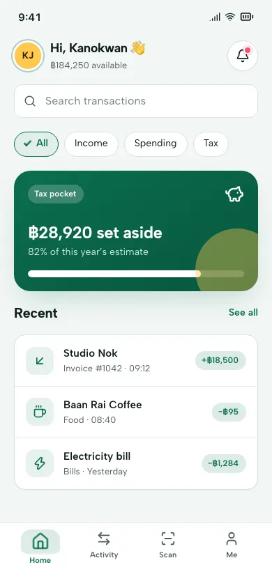
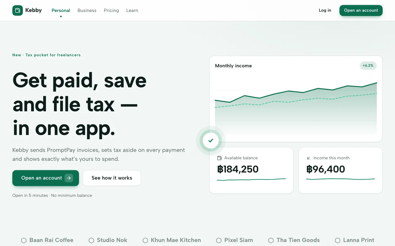
A calm, clean interface where every control answers back: ripples, drawn checkmarks, bouncy toggles, pinging dots and gentle hover lifts.
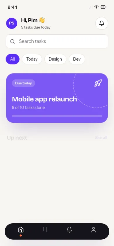
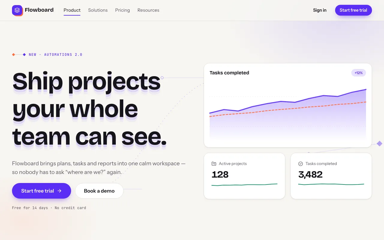
Animation is the structure: content rises in staggered, springy waves, sections reveal on scroll and keyframe marks show the choreography.
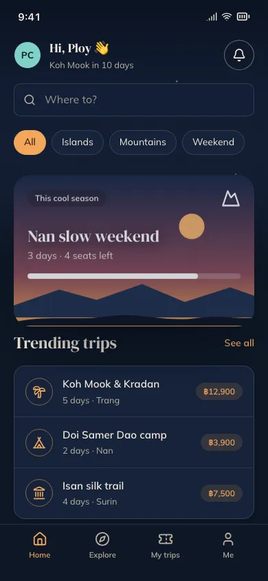
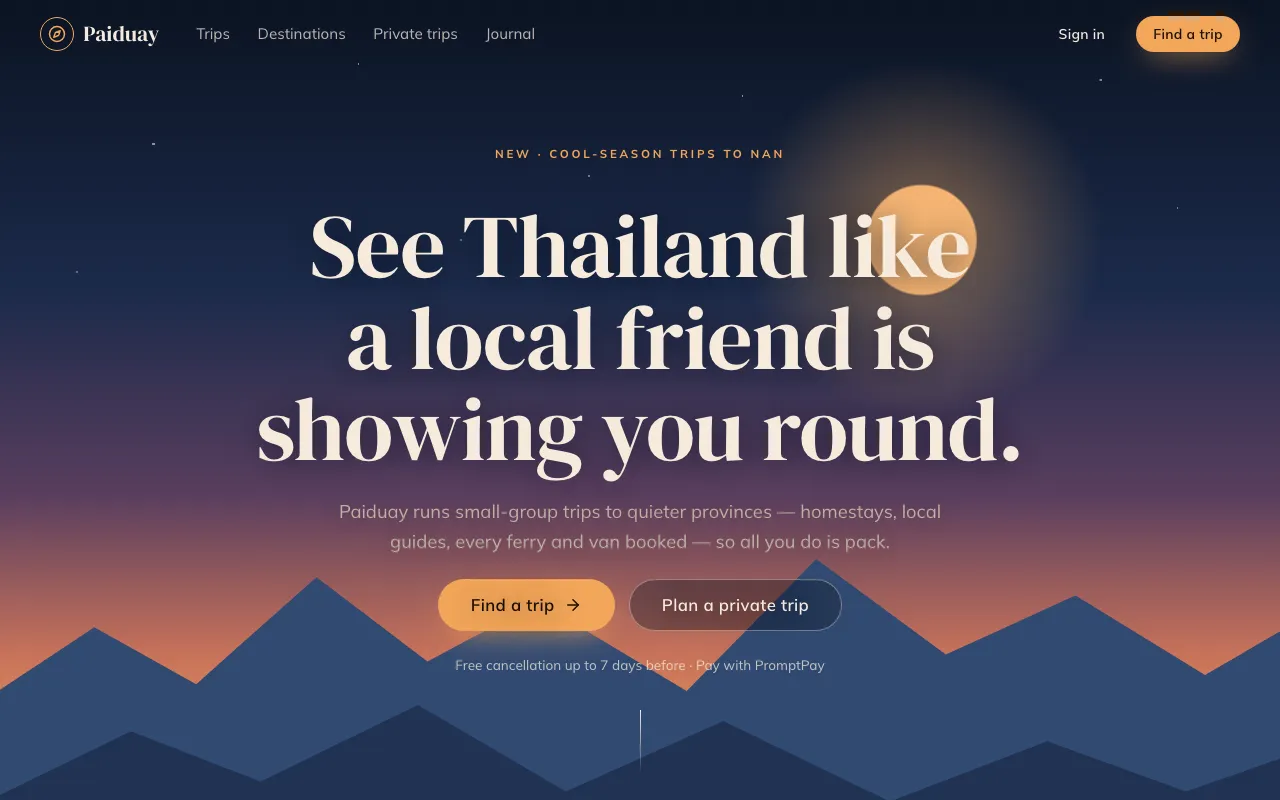
A story told by scrolling: full-bleed layered scenes drift at different speeds while the page unfolds in numbered chapters.
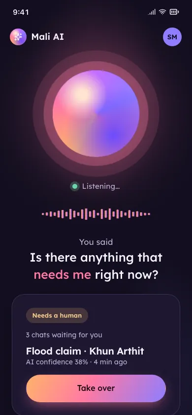
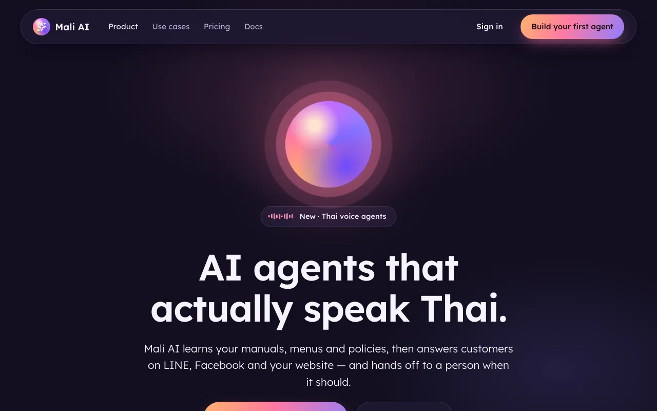
A glowing voice orb and live waveform at the centre, big captions of what was heard, and thumb-sized buttons so speaking, tapping and reading all work.
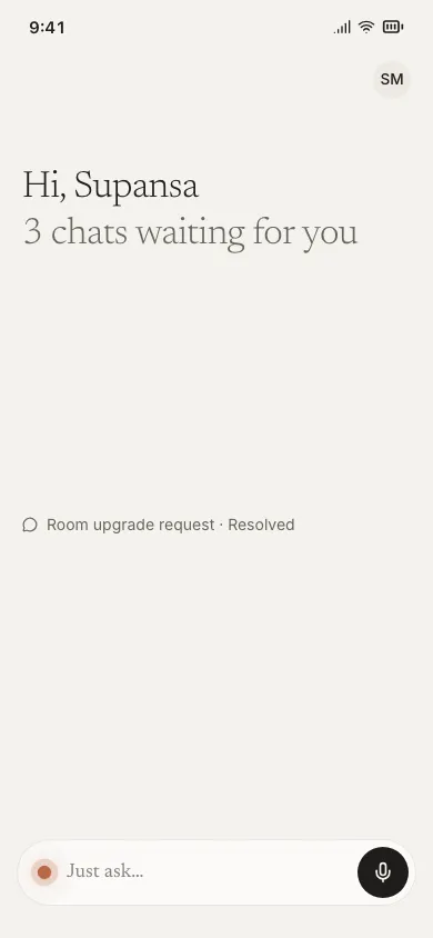
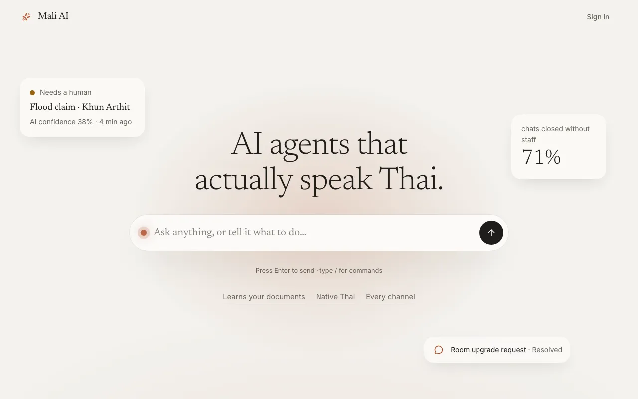
Almost no chrome: one calm sentence, one input, and soft context cards that surface only when they are needed.
Designed for everyone first.
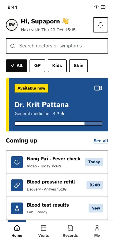
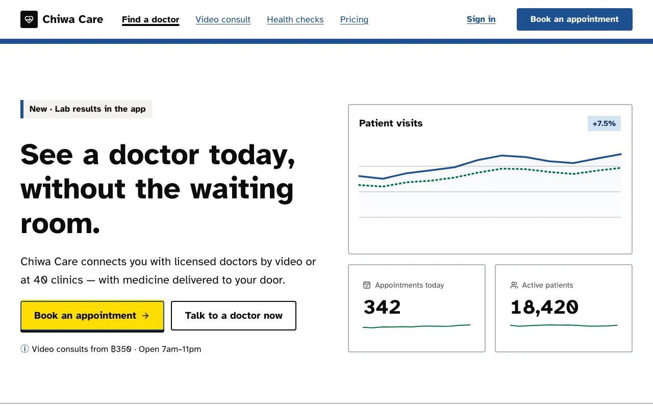
Black-on-white at AAA contrast, 18px+ type, thick yellow focus rings and underlined links — an interface that never tricks or squints.
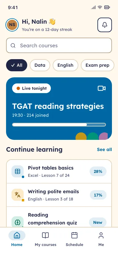
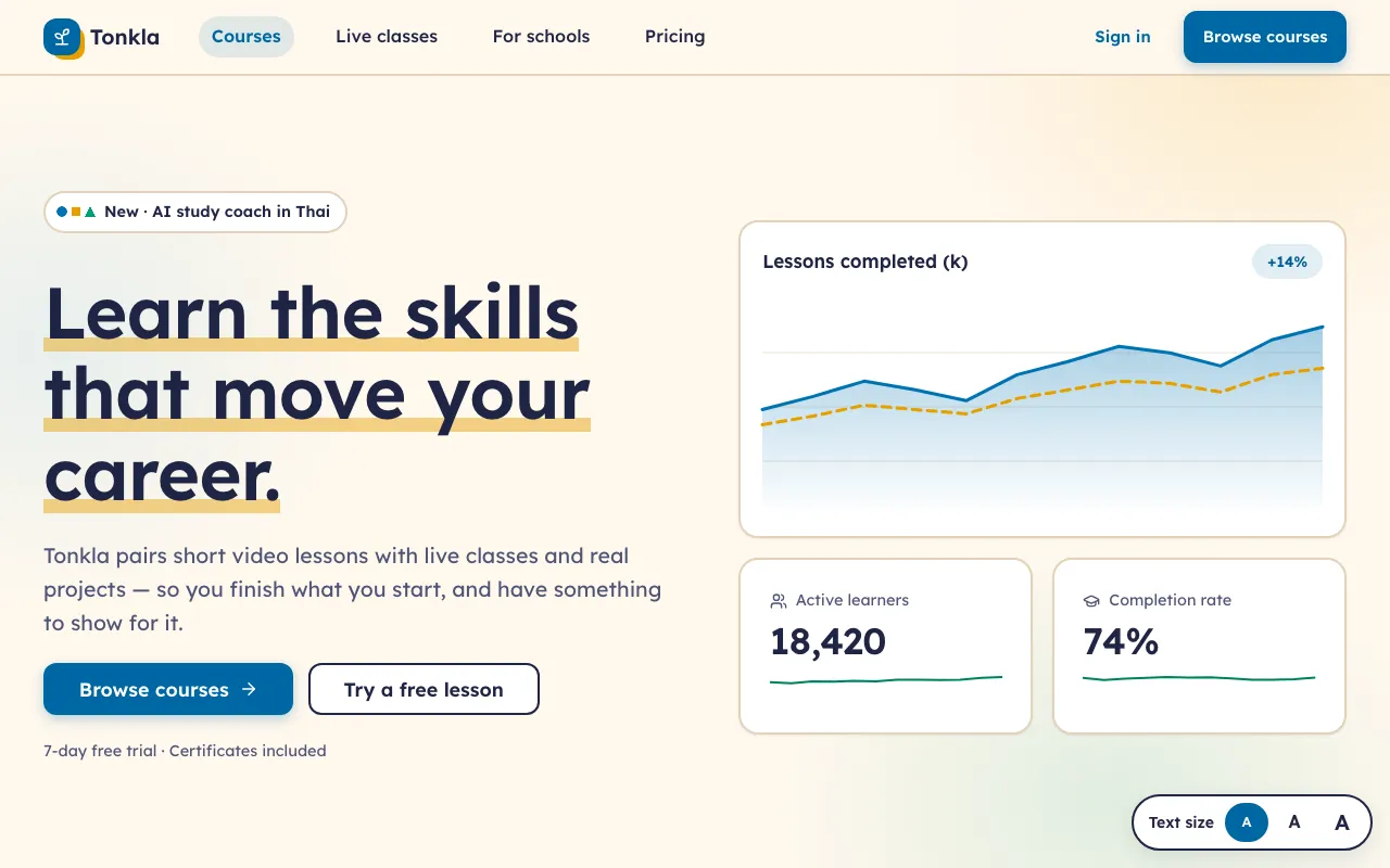
Warm, rounded and multi-coloured with a colour-blind-safe palette, icons that always carry a label, a text-size control and people of every skin tone.
Layouts tuned for conversion.
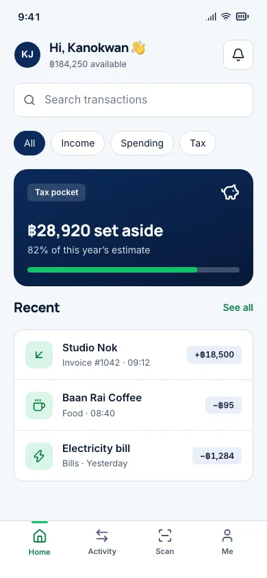
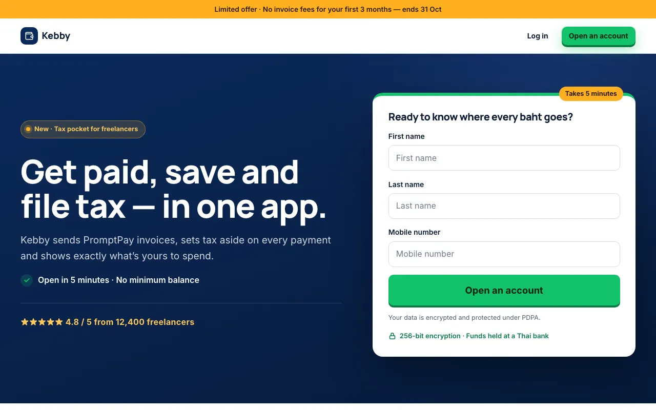
One goal per page: the sign-up form sits in the hero, trust badges sit next to the button, and the same bright CTA repeats down the page.
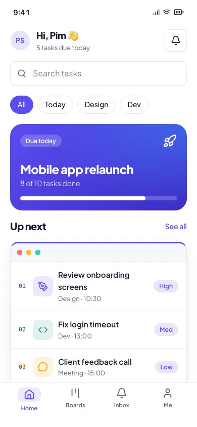
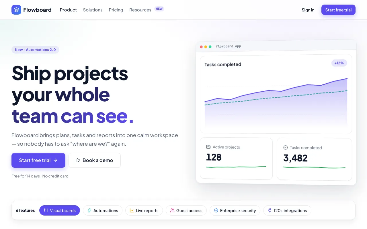
A long, organised product tour: a feature index, an overview grid, alternating deep-dive rows, tabbed screenshots and a plan comparison table.
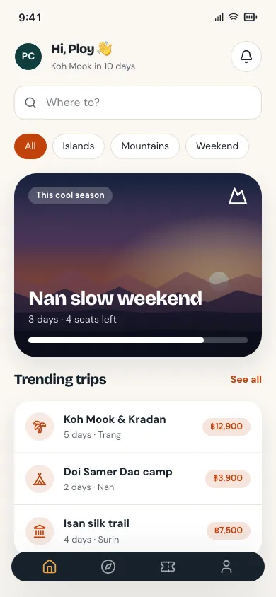
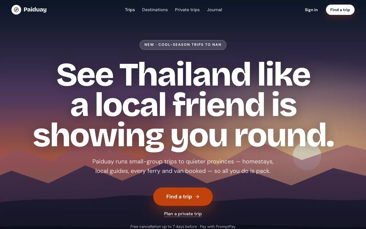
One full-screen scene, one giant headline and one CTA carry the page — everything below the fold is short and quiet.
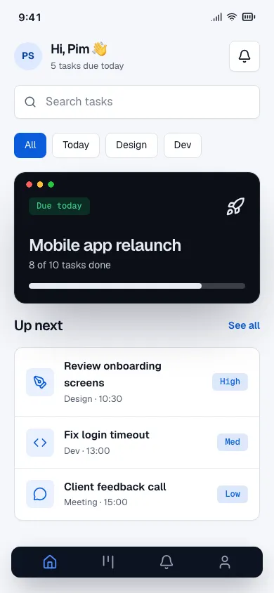
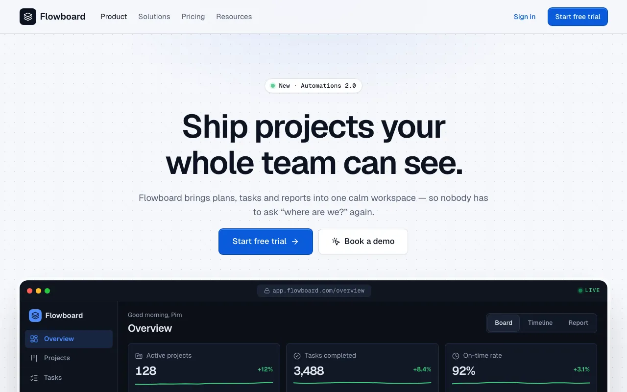
The hero is the product: a full, live-looking app window with real data, clickable tabs, hotspots and a guided cursor, framed on a calm technical page.
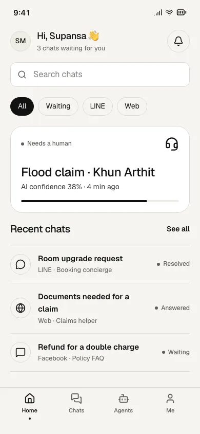
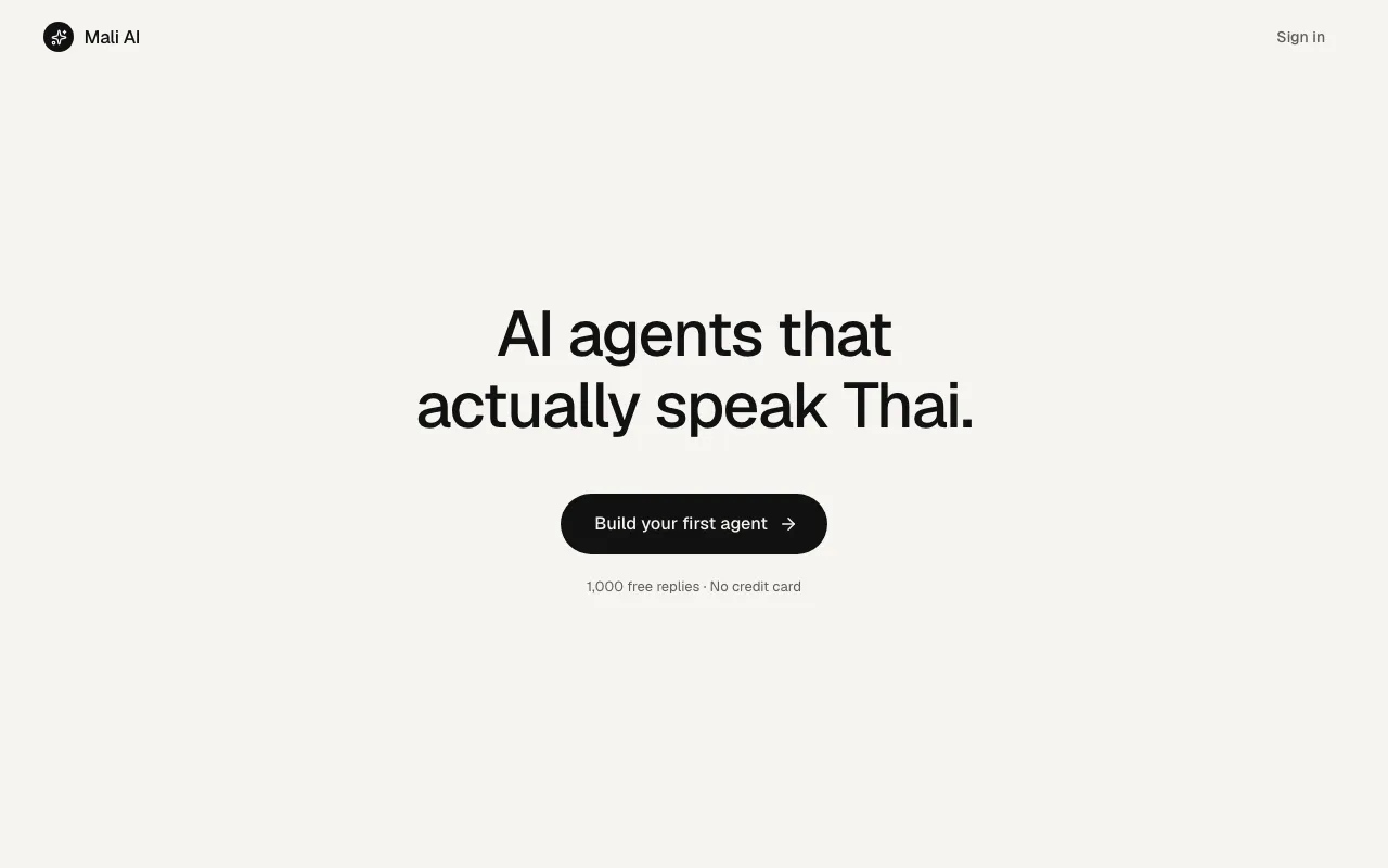
The whole landing page is one screen: one plain sentence that says what it does, one button, and nothing else.
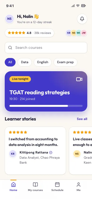
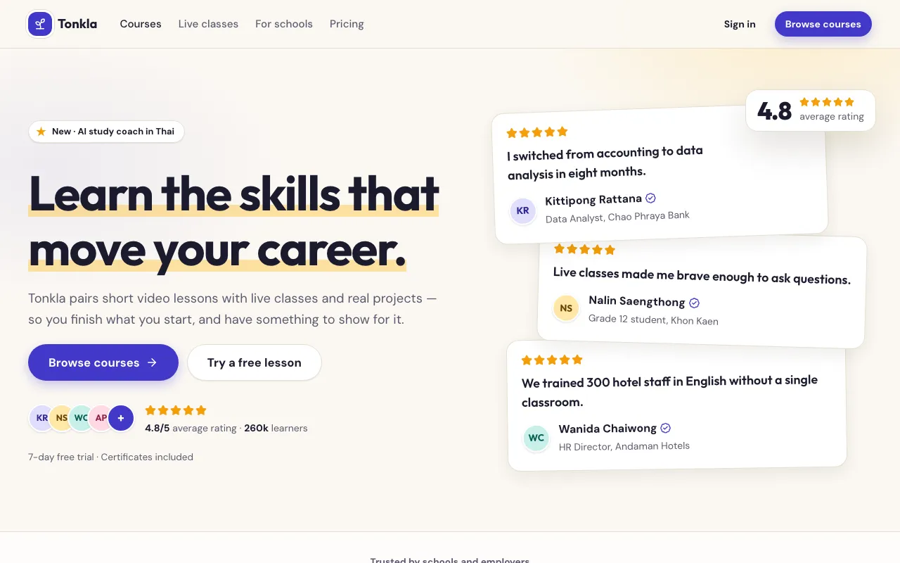
A landing page that lets other people do the selling: star ratings, review cards, avatar stacks, logo walls and big numbers fill the page.
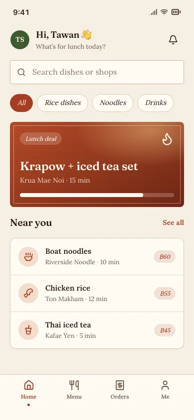
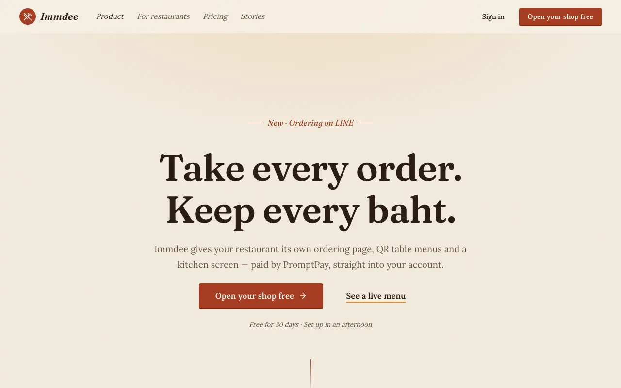
A landing page read like a short book: an opening line, numbered chapters, a founder’s or customer’s story, a journey timeline and a quiet ending with one ask.
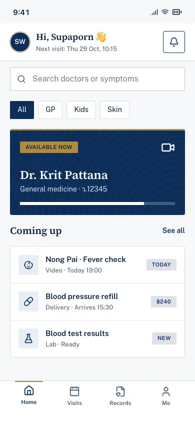
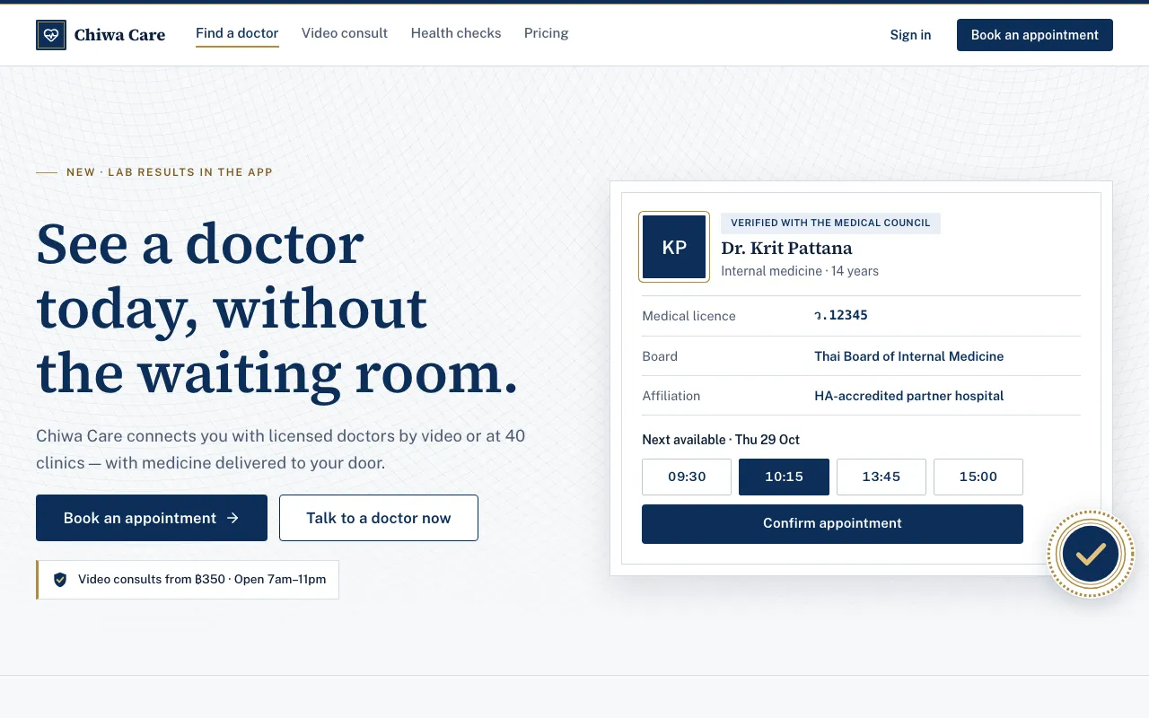
A conservative navy-and-white landing page that leads with credentials: accreditation seals, licences, expert names, guarantees and hard numbers.
Analytics and BI layouts.
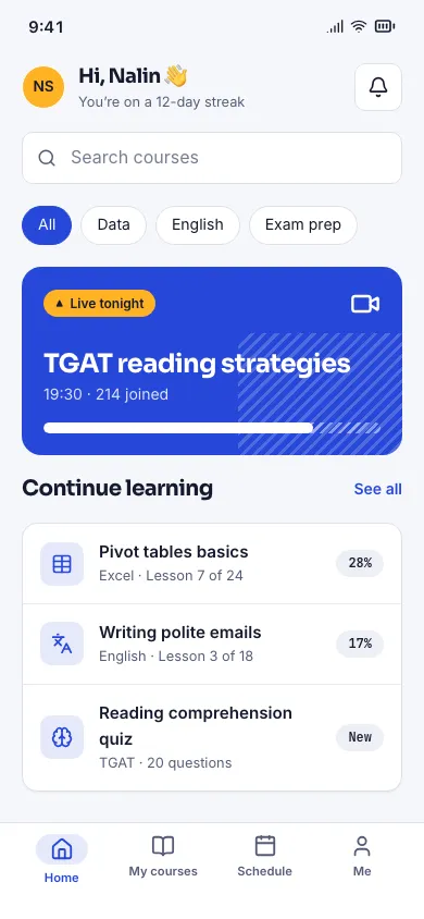
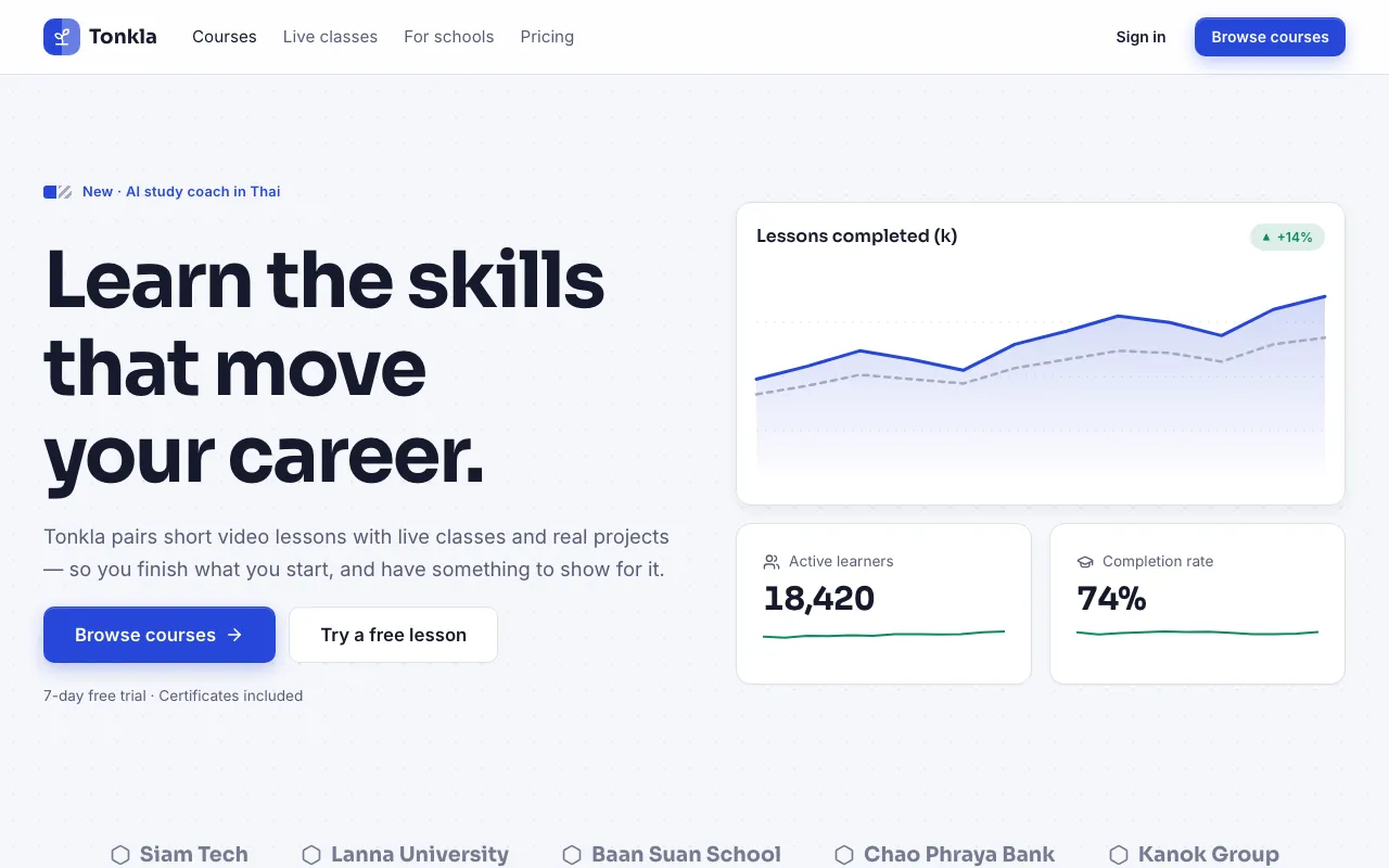
Every number has a partner: solid cobalt for this period, hatched slate for the last, an amber “vs” between them and a ▲▼ delta badge on everything.
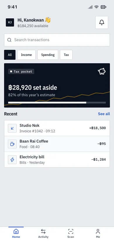
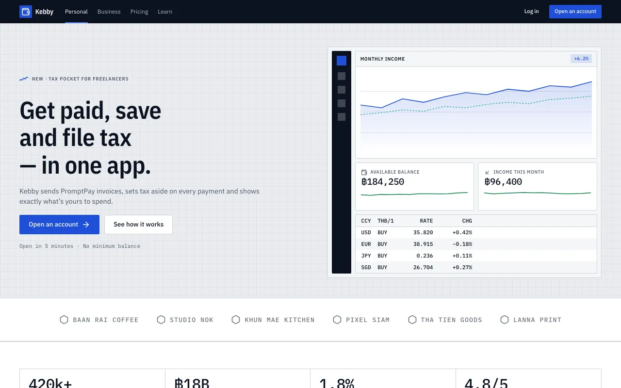
Compact, hairline-gridded panels packed with small condensed type, tabular numbers, zebra tables and a sparkline on every figure.
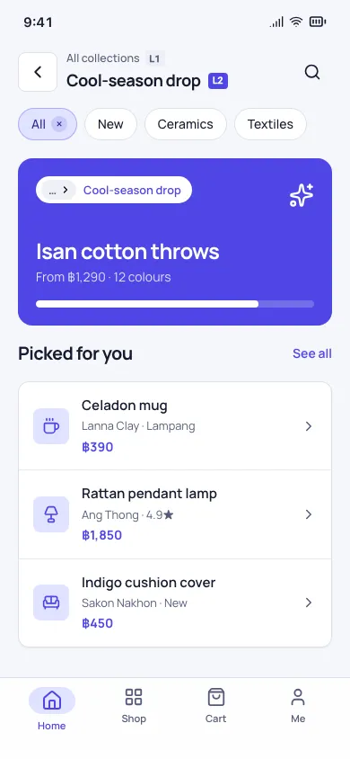
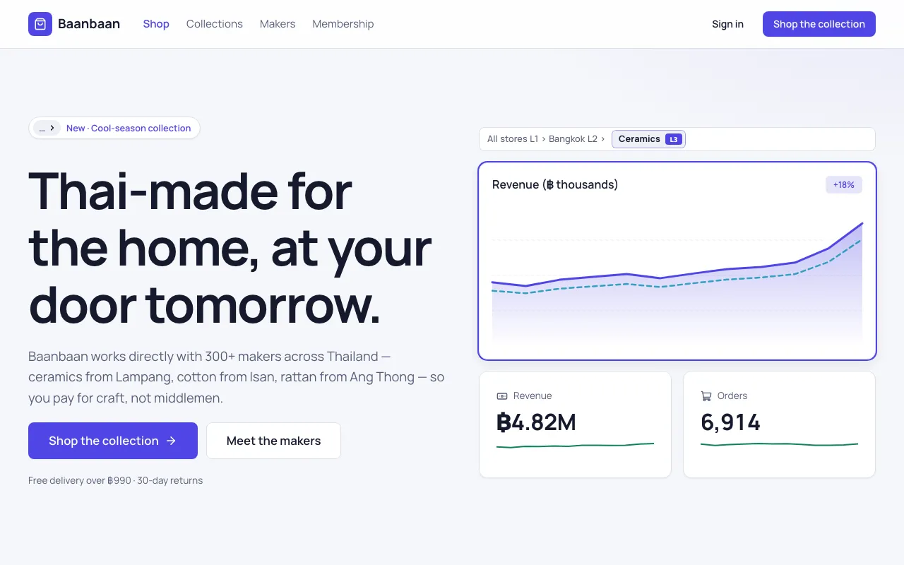
Breadcrumbed hierarchy, removable filter chips and expandable rows: start at the total, click a funnel step and dig down to the table that explains it.
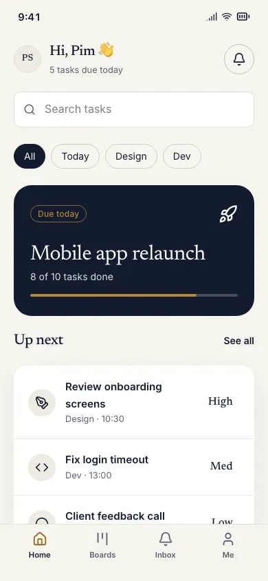
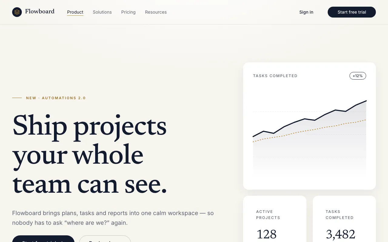
Four huge numbers, one trend line and a one-paragraph story on lots of warm white air — the dashboard you can read in five seconds.
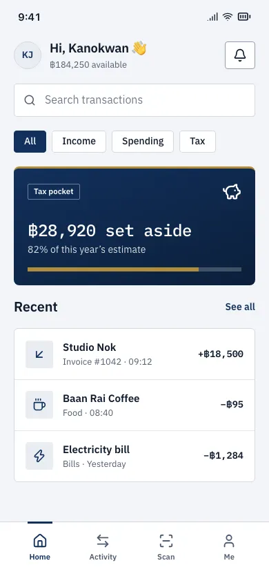
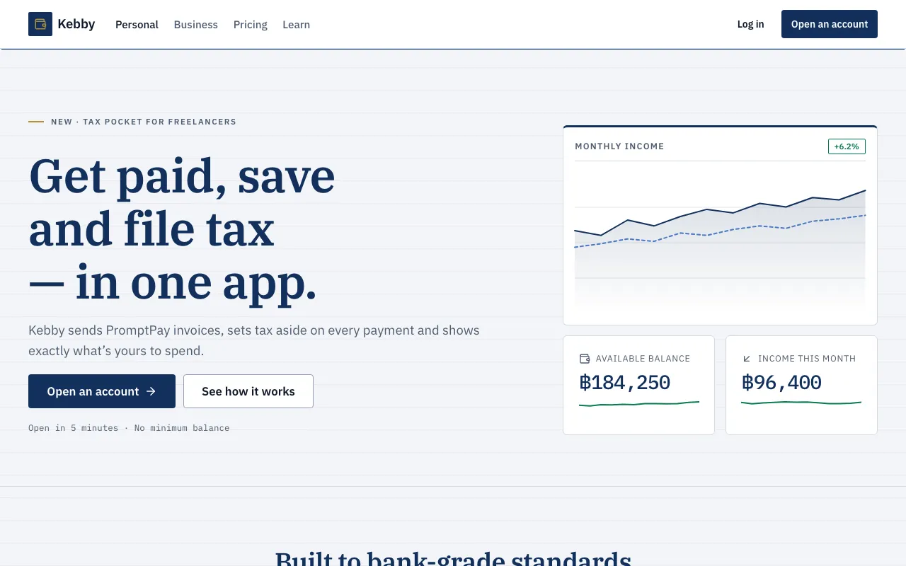
A P&L statement, a cash-flow waterfall and right-aligned tabular figures on serious navy — red and green mean good and bad, nothing else.
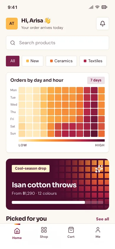
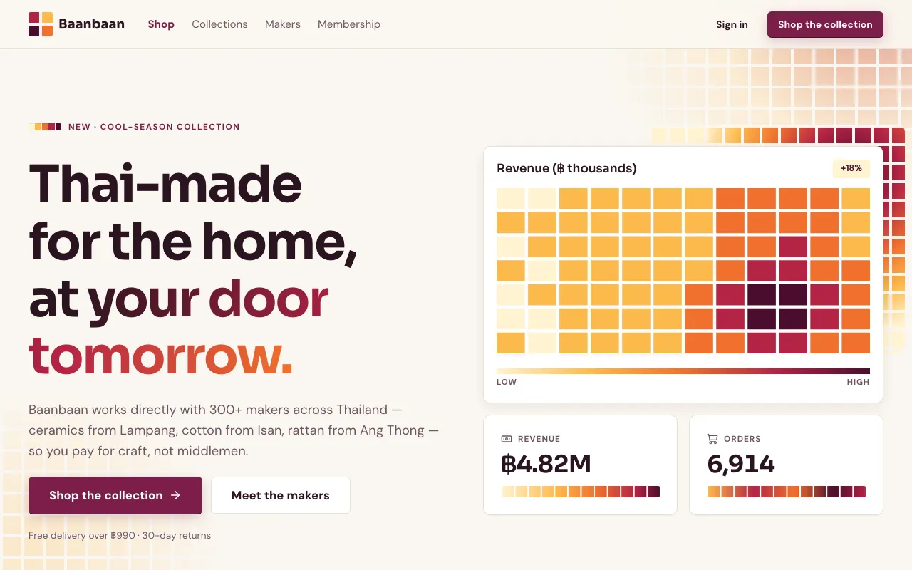
Colour-intensity grids lead the page: a warm sequential ramp from pale butter to deep plum turns every number into a tile you read by heat.
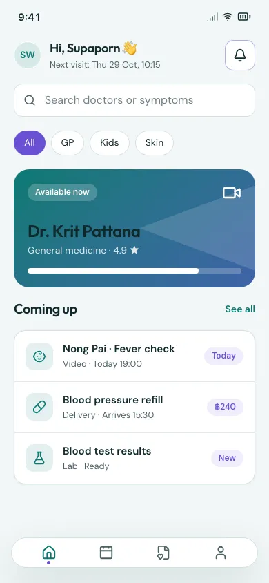
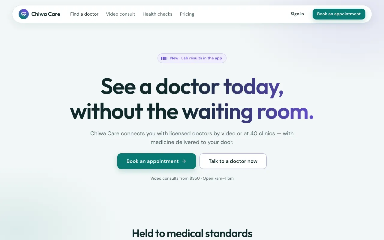
The future is drawn as a widening violet fan of confidence bands right of a “Today” line — with scenario toggles, driver bars and model-confidence meters on every prediction.
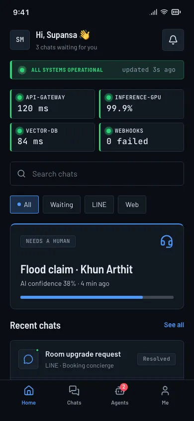
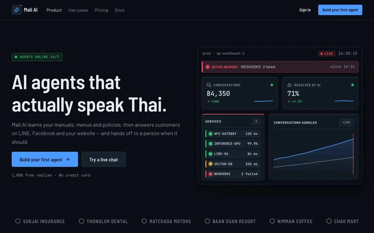
A dark ops-room console: status tiles first, pulsing live dots, a ticking clock and red/amber/green reserved for health status.
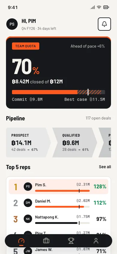
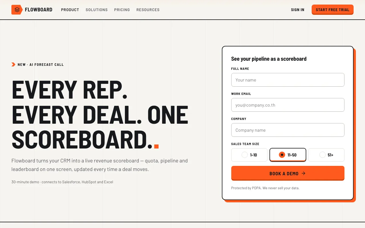
A revenue scoreboard: a thick quota bar with commit markers, chevron pipeline stages, a ranked rep leaderboard and a deal table in ink, paper and signal orange.
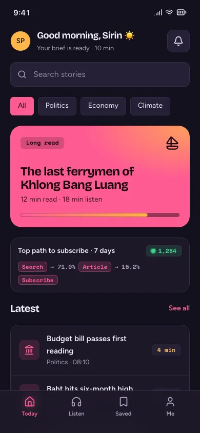
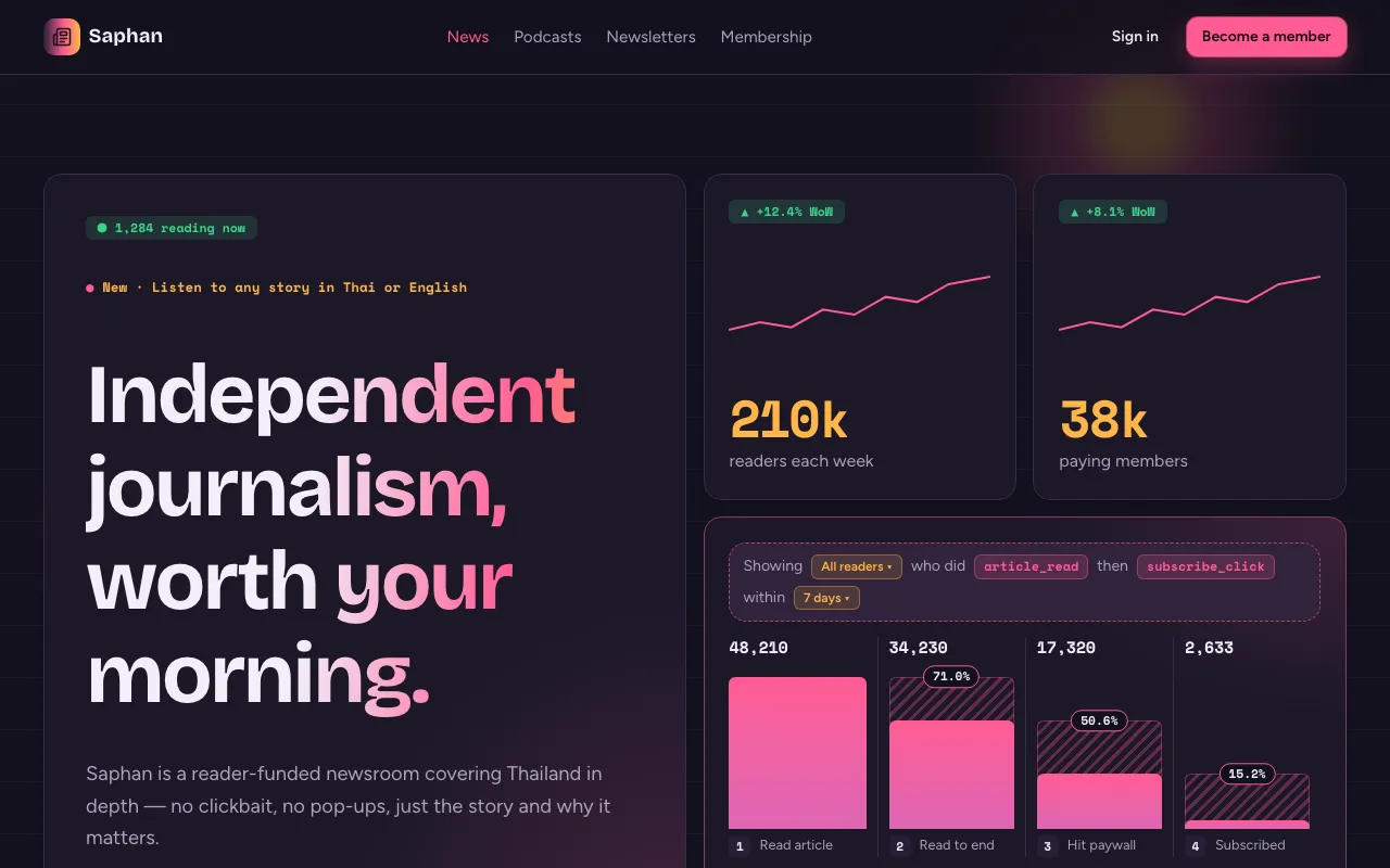
A dark plum lab for how people move: a sentence-style event query, a step funnel with hatched drop-off, a magenta-to-amber retention triangle and flowing journey paths.
Big‑company system aesthetics.
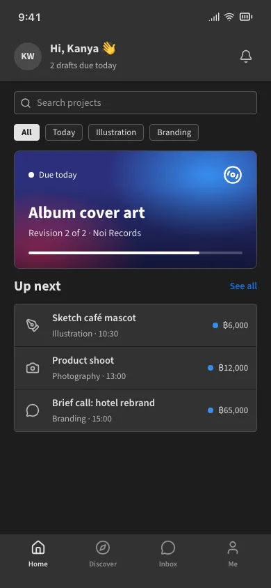
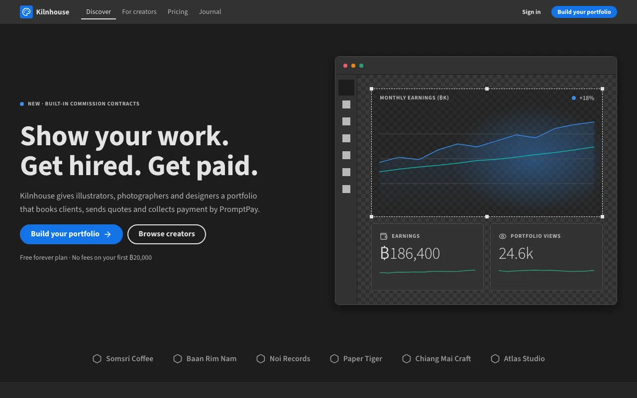
The classic Creative Cloud workspace: dark charcoal panels, compact 32px controls, 4px corners, outlined pill buttons, blue focus and a canvas you work on.
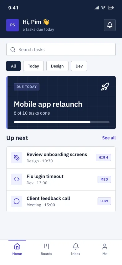
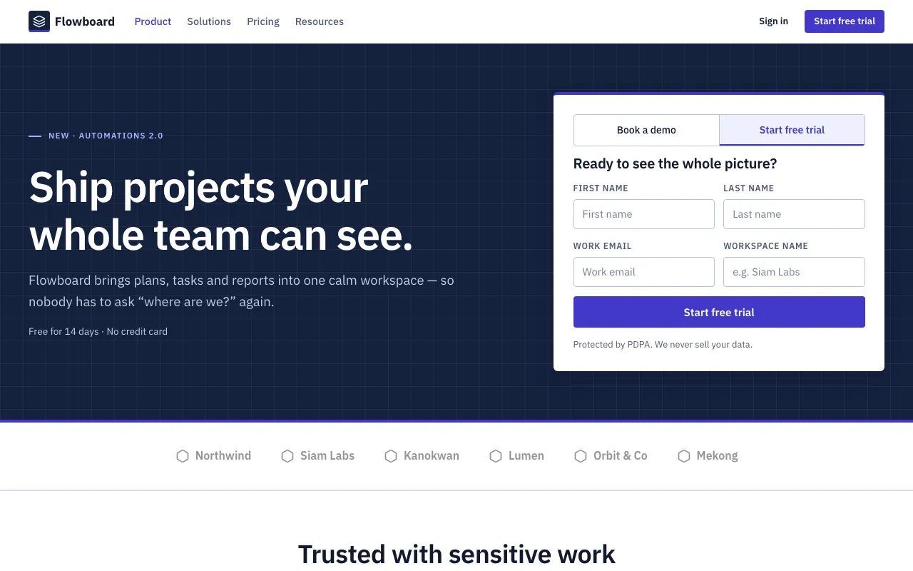
Professional B2B software: navy shell, indigo actions, IBM Plex, dense zebra tables, uppercase labels, approval badges and role-aware layouts.
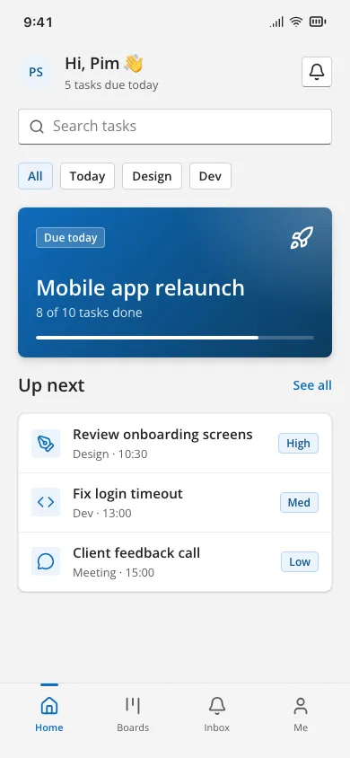
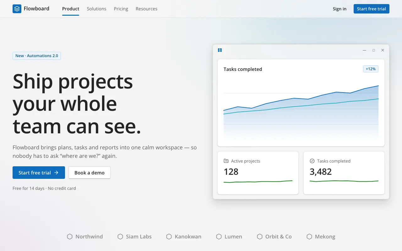
Microsoft-inspired calm productivity UI: light grey Mica canvas, frosted acrylic bars, 4px corners, brand blue #0F6CBD and pill selection indicators.
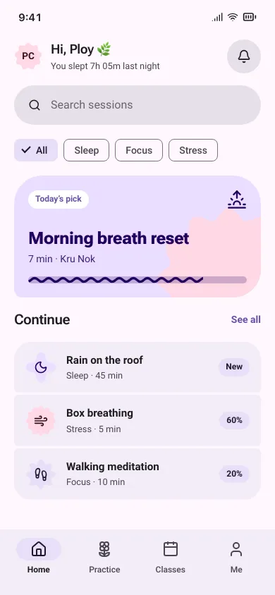
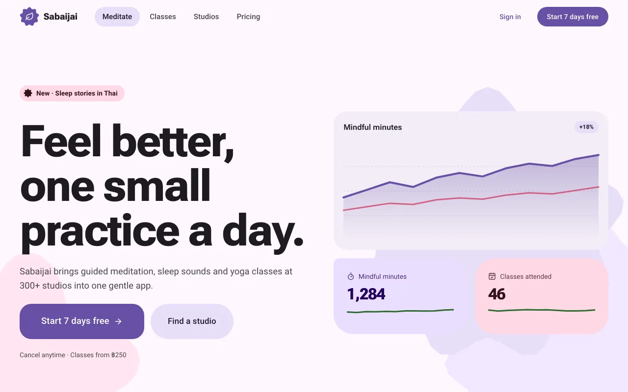
Google’s tonal Material You, made bolder: lilac tonal containers, scalloped and clover shapes, springy morphing corners and big FABs.
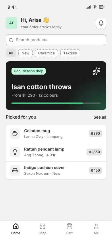
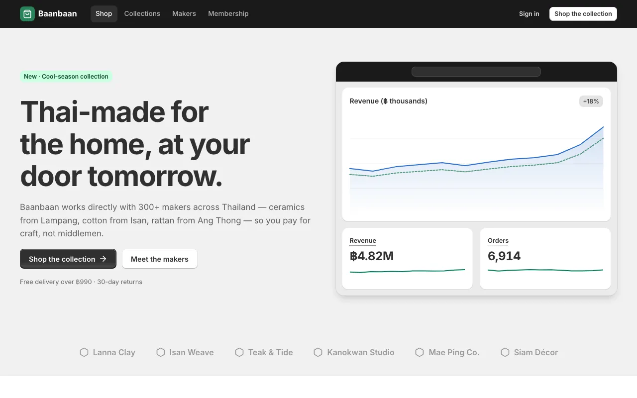
Shopify’s merchant admin: a grey canvas, dense white cards, black bevelled buttons, a black top bar and green for every success.
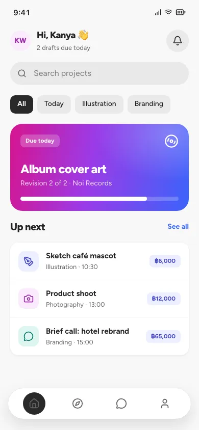
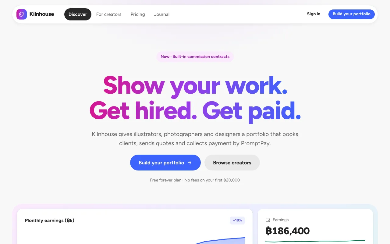
Adobe’s friendlier system: light canvas, rounder 8–24px corners, filled pill buttons, heavy 800 headlines and confident pastel-plus-saturated colour.
Born on phones, scale up to web.
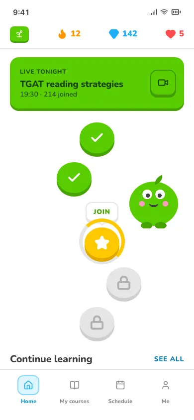
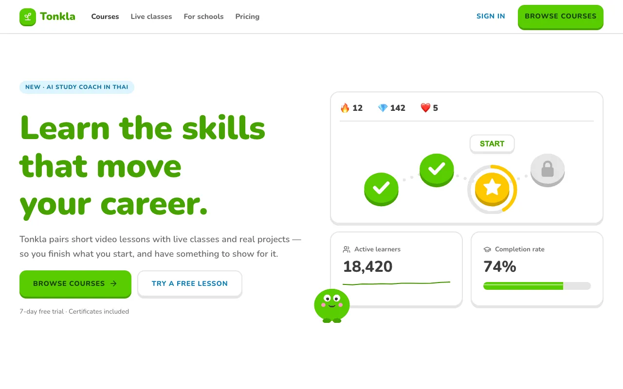
Bright green chunky buttons with a 3D bottom edge, streak flames, XP bars, lesson paths and a friendly mascot — learning that feels like a game.
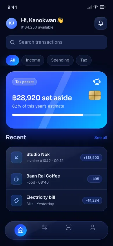
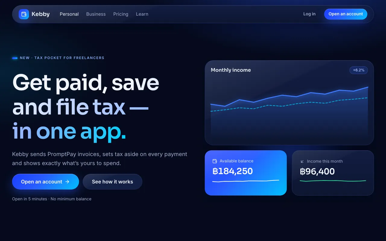
Midnight navy, one electric-blue gradient and glossy metal-card surfaces — the polished feel of a premium neobank app.
Local craft, scripts and culture.
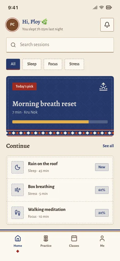
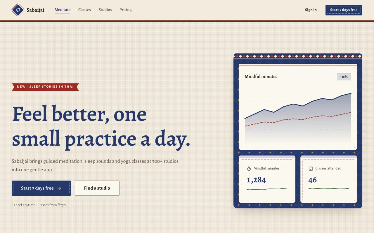
Hand-dyed indigo, lacquer red and teak on unbleached cotton, edged with woven tin chok hem bands and running-stitch outlines — calm Northern Thai craft.
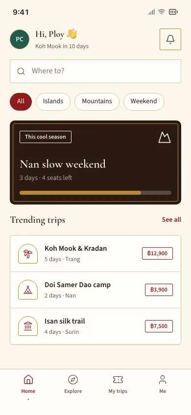
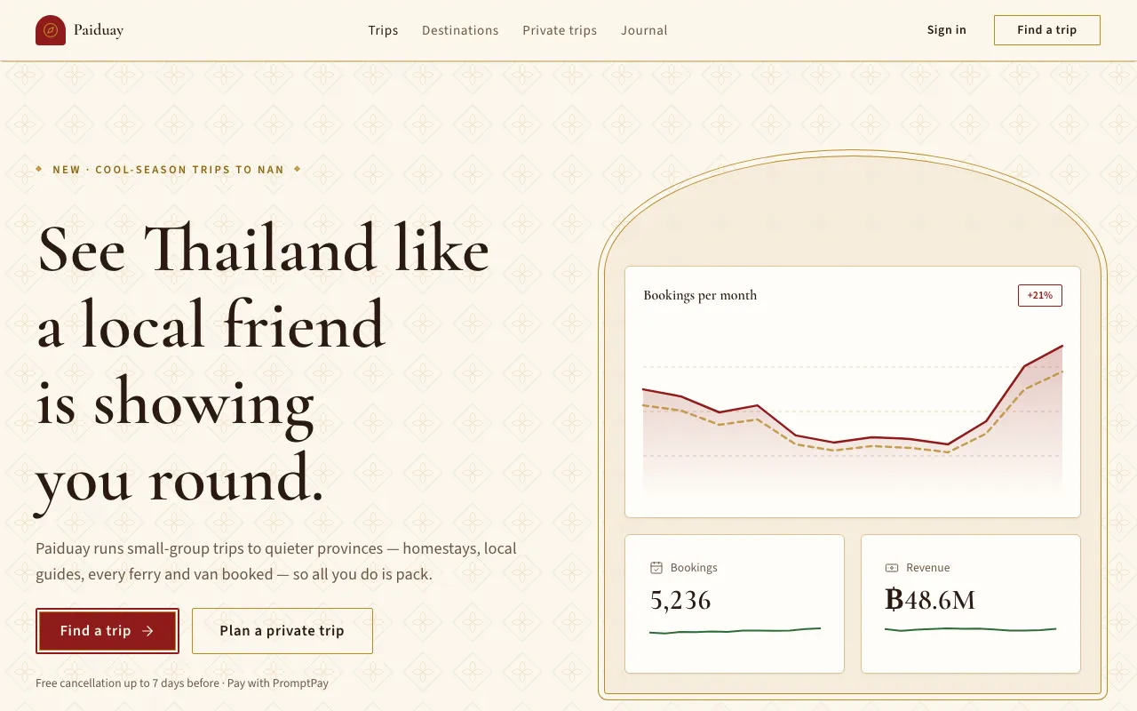
Ivory paper or lacquer black, temple red and leaf gold, framed with Prajam Yam motifs and pointed-arch shapes — Thai craft in a clean modern layout.
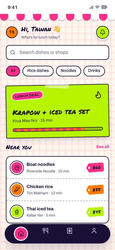
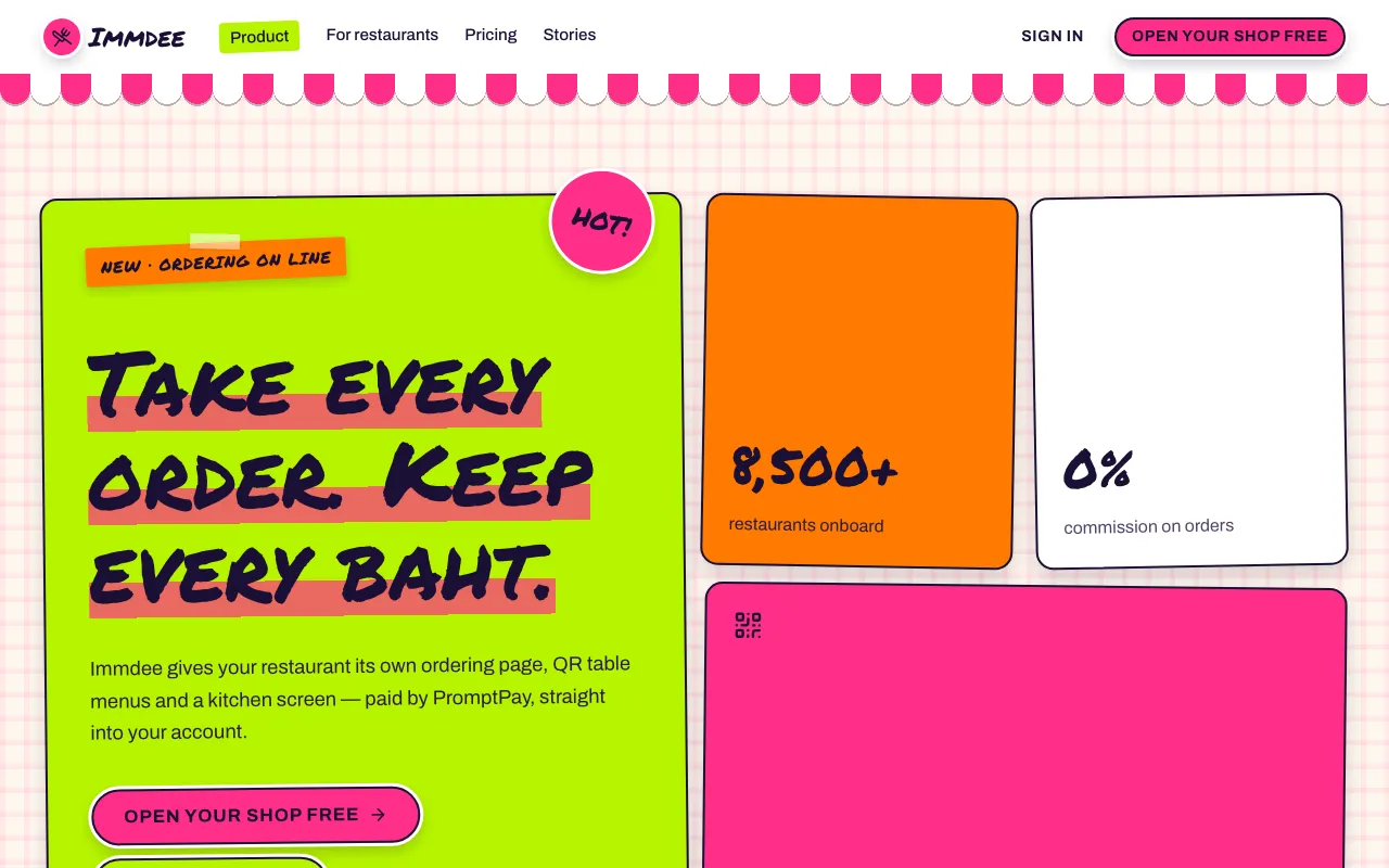
A Bangkok night market on screen: hot-pink, lime and orange plastic colours, marker-lettered signs on fluoro card, price tags, striped awnings and sticker badges.
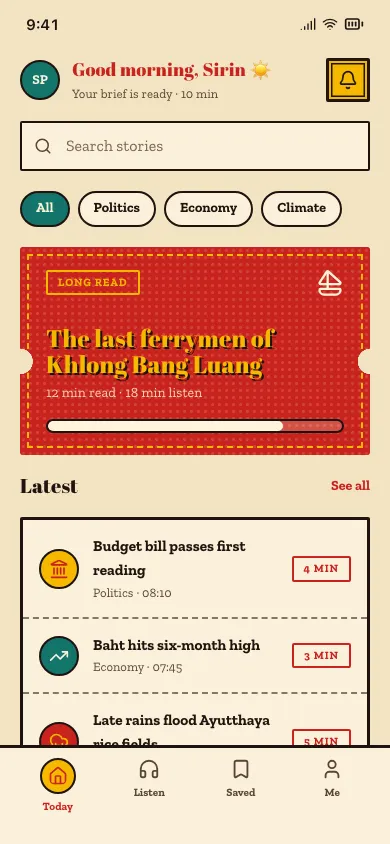
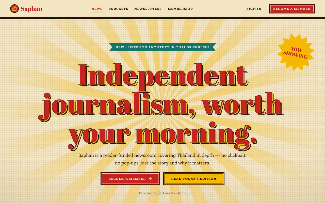
Hand-painted 60s–70s Thai movie poster: fat high-contrast Thai display type with outlined drop shadows, red-yellow-teal on aged paper, halftone and starbursts.
No style matches. Try fewer filters.